Weight Watchers and Jenny Craig are established household names in dieting and weight loss.
In 2018, Australians spent a total of $6.6 Billion on weight loss products.
Both businesses are international and have been established in Australia for over a decade. So who has the best marketing strategy and implementation? We’ve taken a deep dive into their digital activities to take a look.
WW History
Weight watchers, or WW as they now want to be known, is the health and weight loss behemoth. They’ve been around forever, and everyone seems to like them.
Originally founded in 1963 in Queens, New York (thanks Wiki) they now have 18,000 employees, $1.5 billion in annual revenue (more than twice their closest competitor Nutrisystem) and operates in countries across the world. https://www.owler.com/company/weightwatchers#competitors
ampaign with Sam Armytige via both the imagery and inspirational quote, lists the programmes key features and also includes the current special offer – WW appear to always have a special offer. There are CTAs at both the top and bottom of the email so I think they’re doing a good job here.
They’ve been around for a significant time and were formed at the birth of the modern weight loss (and arguably the start of the obesity crisis). It is the most commonly used diet in the world with 4.5m subscribers in July 2018 (again thank you Wikipedia).
So how does WW shape up (pun intended), in the modern digital world, and how are they coping with the growth of insta-diets, trend setters and influencers?
ch term trends show limited growth, with the Google trends for diet only increasing slightly over the 5 years, and trends for terms like diet plan & weight loss being fairly static.
Product
As they proudly promote on their site, Weight Watchers is #1 Best Diet for Weight Loss 9 Years in a Row (U.S. News & World Report). They’re also #1 best commercial diet. Plus the diet has been proven to work in a randomized controlled trial which was published in the Lancet Journal back in 2011. https://www.reuters.com/article/us-obesity-weightwatchers/weight-watchers-works-scientific-study-finds-idUSTRE7867SV20110907
The actual system WW utilise has evolved over time. They have continually tweaked their system as our knowledge of health and diet has evolved. One of the more significant changes came in 2012 when they rolled out a health and wellbeing aspect to the program, and 2014 when they launched expert coaching.
The core of their product throughout their existence has been group meetings, or workshops as they are currently called, where members are weighed, weight loss successes are celebrated and the team leader will discuss a topic related to healthy living and weight loss. To the non-initiated this might seem slightly cringeworthy, but WW stand by the weekly weigh in as keeping you accountable, and the community support aspect is why many say WW is so successful.
Obviously the market for weight loss and healthy living has shifted dramatically in the last 10 years with the help of social media marketing, influencers and apps changing the way services are delivered across many industries. WW have kept pace with these changes. If you visit the WW site today you are now able to sign up for 3 different types of plan; digital, workshop & digital, personal coaching & digital.
With the focus on community with WW it’s therefore appropriate that they have an active digital community for the members who don’t want to go to with a purely digital subscription.
In fact, a large reason for the rebrand to WW was an effort to move Weight Watchers away from its position as diet brand, and towards a positioning as a lifestyle and wellness brand. The initial impact of this seems to have been a slight dip in subscriptions which WW reporting a lower than expected revenue target for 2019. But repositioning a brand takes time, so we will have to wait and see what the full of impact of this is.
As with some of their competitors like Jenny Craig, WW is eligible for rebates from a large number of Australian health funds.
There may have been some short term up and downs, but WW have kept up with the market with the range and delivery of their services.
Jenny Craig History
Like WW, Jenny Craig is head quartered in the US. It was however originally founded in Melbourne in 1983 and didn’t start operations in the US until 1985.
Relative to WW they are a small business, with 3,000 employees and a revenue of $66.5m US , compared to WWs $1.5B. However they remain one of WWs largest competitors and are also trade in 114 countries around the world. They have over 700 locations worldwide, and over 100 here in Australia.
Product
The Jenny Craig product is somewhat similar to WW. As a member you attend weekly consultations with a Personal Consultant who will give you guidance, and helps you set realistic weight loss goals. This is a 1 on 1 consultation rather a group meeting. Which will obviously appeal to some people more. It is also possible to do the consultations via the phone or online if you don’t live near a Jenny Craig centre.
The significant difference between WW and Jenny Craig however is that you need to buy their premade meals until you are half way to your weight goal and transition to home cooking.
The provision of premade meals and snacks is great for some people. It removes choice, makes the process of moving to healthier meals easier, and helps constraint portion size. However the need to buy these meals does make the diet significantly more expensive than it is initially advertised as.
Jenny Craig also has research which supports it as a proven weight loss programme, with research showing that on average after 2 years Jenny Craig members weighed 7% less than when they started the programme, and that the longer they stay on the programme the more weight they lost (https://www.ncbi.nlm.nih.gov/pubmed/20935338).
Jenny Craig does lack the digital only option of membership which WW provides. It has also remained solely focused on weight loss, rather than shifting to general lifestyle and wellness. It is also doesn’t have the active community which WW does on their app, but this is a intrinique to their business model. You do your consultations alone, you are not part of a group or a community in the same way as WW.
Product conclusion
Both WW and Jenny Craig have proven weight loss solutions backed up by research. They approach the challenge of weight loss from slightly different angles, but coincide in having weekly check ins to keep you accountable. The differences in the way the service is delivered between the different companies will appeal to different people. However there is a significant difference in cost.
Currently WW costs between $37.50 and $96.50 (all options coming with one month free), with the digital only option being cheapest and personal coaching along side meetings being the most expensive.
In comparison Jenny Craig is $0 per week for 10 weeks, then is only $99 for the next 6 months. However you must buy their food which is around $160 per week, this is then topped up with some fruit and vegetables. Obviously you are also buying food on the WW programme, but at more than $160 per week, you would almost certainly be spending more on food than you would on the WW programme.
WW Website
So, onto their website.
Home page
As soon as I arrived at their site I was greeted by an image of Sam Armytage from Channel 7, one of their recent ambassadors, along side a limited time special offer (they appear to be ‘on special’ most of the time). This is a good start and helps create an affinity with their core target market, which traditionally is 40s+ women, but they appear to be chasing a younger market with the recent WW rebranding. It’s a small detail but the image looks a bit washed out to me, which appears to be their imagery style – but I think with this one it makes it appear a bit flat. I would be suggesting they go with something a bit brighter for their headline image on their site.
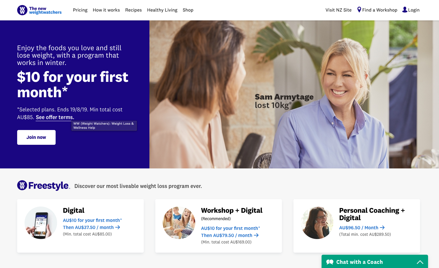
Overall however the home page is pretty much what you’d expect from a large service business. There are plenty of call to actions to find out more about the program and how it works, information on what you get as a member, and an initial introduction into the three plan types. They have a live chat popup, and a CTA at the top and bottom to join now.
They’re using a static banner at the top with one key message which is good, rather than trying to get you to take in 3 or 4 different messages (of course it’s always easier when you have one key product – try doing this as a retailer).
Below the main banner there are tiles with which show the pricing for the three service options up front – making it nice and easy to understand what the pricing is. There’s no ambiguity here.
Below this section they jump into an article about Sam Armitage and her story, this I also like, if you’ve decided this is the right ambassador for your audience then you should leverage them as an asset.
On element that isn’t great on the home page, or across the site are their CTA buttons. They’re either blue on white, or white on blue. They lack contrast with the rest of the page and it’s clear that they want me to click on one.
Sign up process
The sign up process is reasonably straight forward. As previously mentioned there are various subscription offers available, I went with the digital only option – and started feeling guilty about the chocolate which came with my coffee.
The plan details page itself is well structured, in the top area above the fold the three plans are listed along side their costs, with clear information on what the minimum charge is. Moving between these changes the information further down the page on the plans features. So far so good.
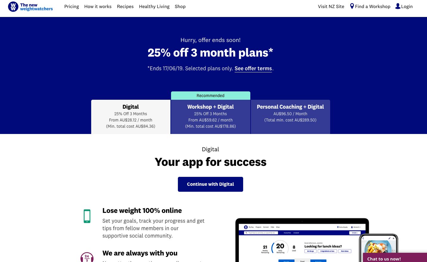
If you get further down the page, because you need more information, there is a nice placement of a product selector. This is a nice and straight forward selection tool which has various questions around weight loss, whether you like direction or prefer self learning and if you want coaching in person, to get to a recommended solution for you. It’s a nice inclusion and the placement on the page is spot on – they’re only putting the selector in front of you if it looks like you might not know which option is best for you.
Back on the selection page, the progress button is reasonably clear, but as I mentioned before it’s blue and blends in with the rest of the page. The small ‘chat with belinda’ live chat option is more obvious in burgundy and gets more of my attention.
The checkout process itself Is fairly painless. The first step involves selecting which version of the digital plan I want to take up, there are further three options here, 3 months, 6 months with the first month free, and 12 months with the first month free. It is not entirely clear to me why I save more on the 12 month option, the monthly cost is only $2 different from the 6 month version, but the saving is $34 more. There is also no live chat option on this page for me to query why.
Overall the page is significantly paired back, removing the navigation and other distractions to keep me focussed on the sale. A good move.
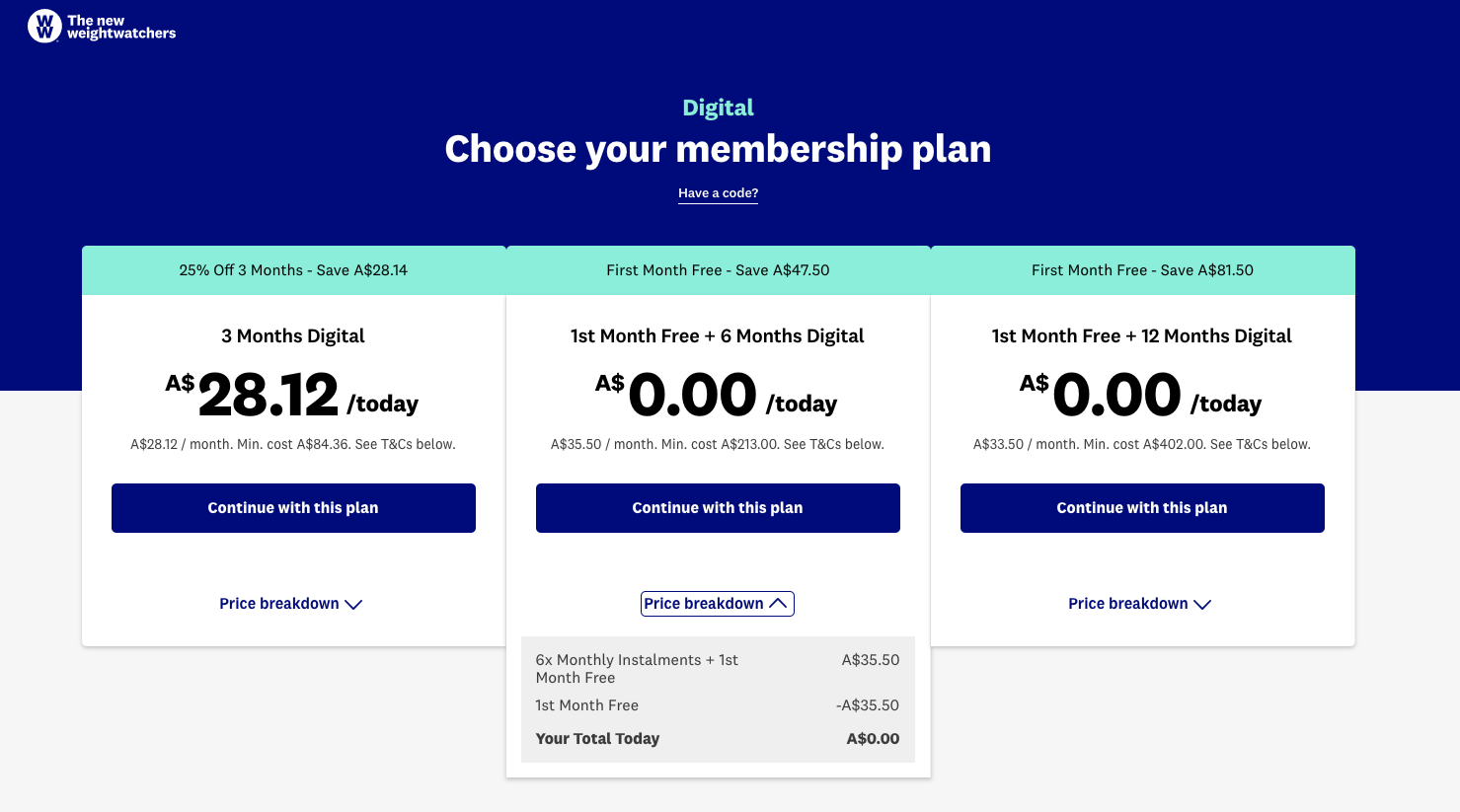
There is also a hefty amount of small print at the bottom of the page covering all three options. Within the first section of this there is a CTA if you want more guidance to take you to the workshop based plans. This should really be pulled out of the small print and given much more focus underneath the plans. I’m making the assumption here that WW make more profit on these plans and want to upsell customers where possible.

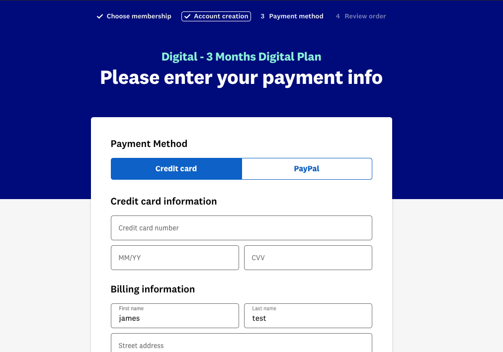
There are then three steps to complete to sign up and make your payment. The process is fairly straight forward, and I can pay by variety of credit cards or PayPal. Interestingly on the payment page there is no information about exactly which cards I can use, although this was on an earlier screen. There are also no stamps or reassurance messages about this payment being secure, encrypted etc. etc. I obviously don’t know what their drop off rate through the checkout process is, but you would assume that some tweaks to this end would help.
A progress bar also appears at the top of the screen here so you know how many steps are left to go.
Logged in
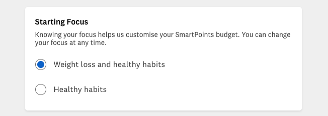
Once I have completed the checkout process and made my payment – I’m logged in, shown a welcome message and then tasked to complete some additional information about my sex, age, weight and overall aims. Am I looking for weight loss and healthy habits, or just healthy habits?
I’m then introduced to the My Day dashboard. There are a few quick tips to help explain the points, and where to search for food and activities to track, but that’s where it ends.
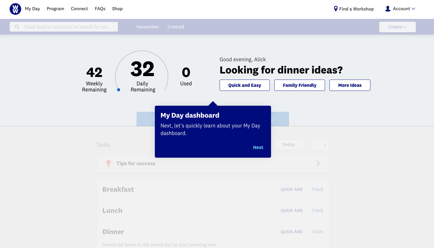
This area really would have benefited from some additional walk through steps. I wasn’t 100% sure what the quick add and track sections were for, and why I have 32 points for today (Thursday) but only 42 weekly remaining. Shouldn’t this be 32×3 (3 days)? I poked around a bit and started adding some food I had for lunch to track how points I’d used – apparently I’d only used 5 points with my salad! Go me!
If you carefully read and work through the process of how WW works before you sign up, a lot of this will make sense, but if you quick skimmed through the pages because a friend or family member had encouraged you to sign up, you really wouldn’t know what is going on here. A lot more guidance is needed for someone like me, a digital only member who isn’t going to get any over the phone or in person coaching.
Eventually I did scroll to the bottom of the page and find a quick guide to getting started link! This is pretty much what I needed to start with, but being below the fold it was lost until I really started digging. There is a reasonable amount of information in here, with links to their partner apps Headpace and Aaptiv (good tie in to the holistic health aspect). It’s here that I also learn that I have a daily and weekly Smart Points budget which is why I have 42 remaining for the week. In the quick guide you are also introduced to WW Freestyle™ – which is apparently the programme I am on. This is the first time I’ve been introduced to the programme name, and it seems odd that it hasn’t been mentioned earlier, or more obviously in the sign up process.
At this point you can start to get quick a lot of information about how the programme and smart points work by clicking through to the cross linked pages. But to be honest, I felt a little lost. There was no breadcrumb or obvious navigation as to where I was in the site and how I would find my way back there in the future. This can be found by clicking on ‘program’ in the top navigation, and going to the WW Freestyle landing page, but the site overall would have benefited from a clearer navigation structure.
To be honest I also find the dashboard a little too basic. There’s no real reference to how I’m tracking as a whole here, some info on how many days that week or month that I’ve hit my points and exercise goal would be nice.
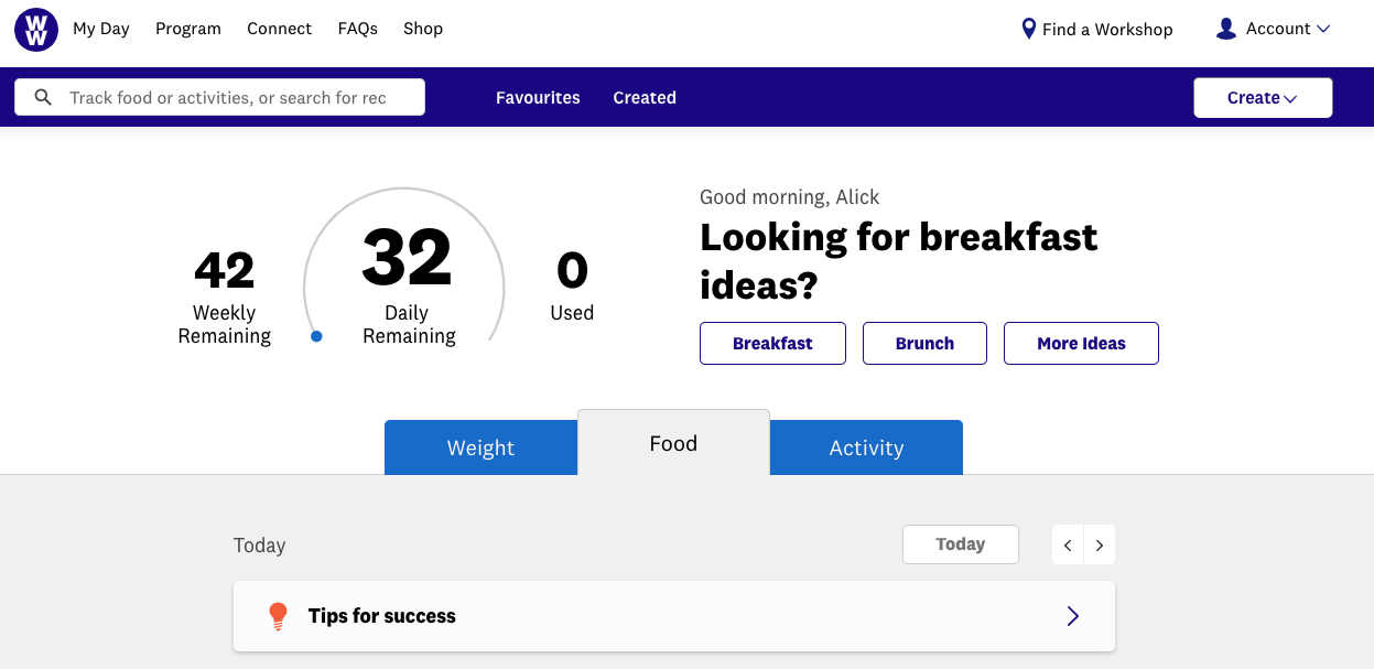
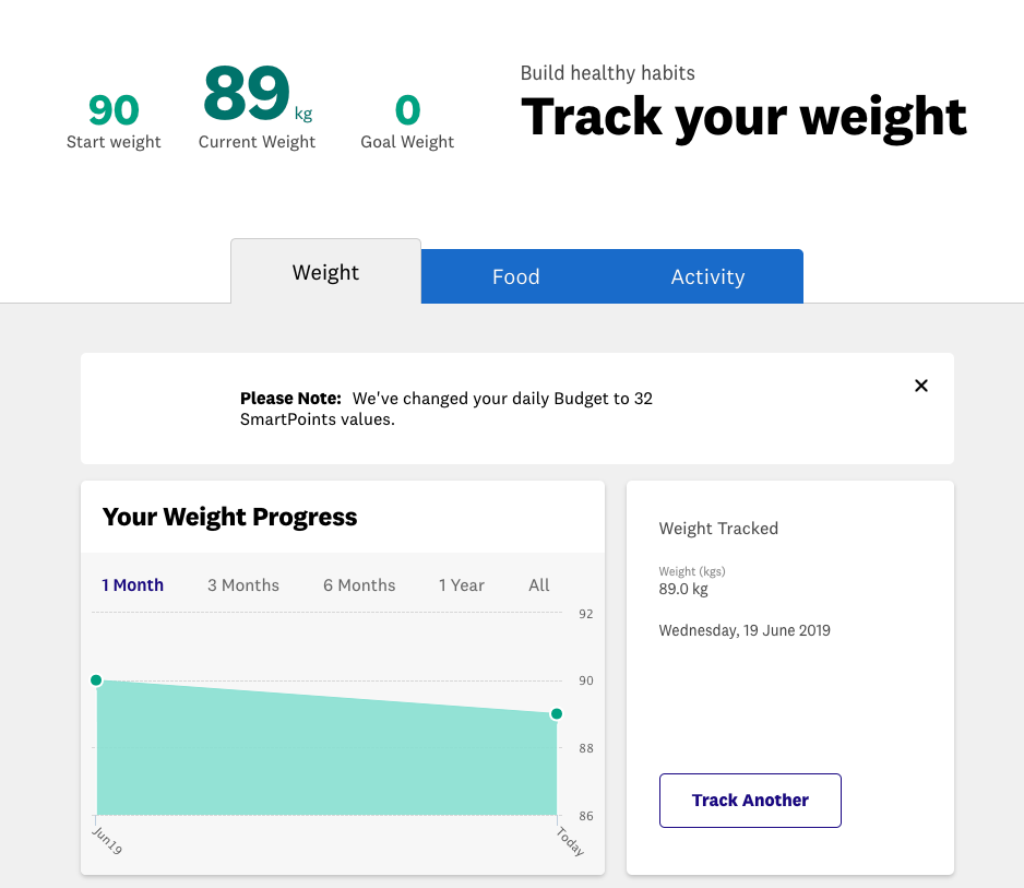
Clicking into the weight tab on the dashboard takes you into a fairly functional weight tracker. This works well but like the dashboard as a whole I feel like it would benefit from a bit more design love.
Clicking into the Activity tab for the first time gets you to re-confirm some data you entered at signup.
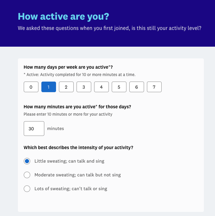
You are then set a Fitpoints goal and are now able to log your physical activity. From here you can also link your wearable device and there is quite a range of integrations with Fitbit, Withing, Mistfit, Garmin & Mapmyrun & Apple Health. Obviously this is vastly easier than manually logging all your activity which would get pretty tedious.
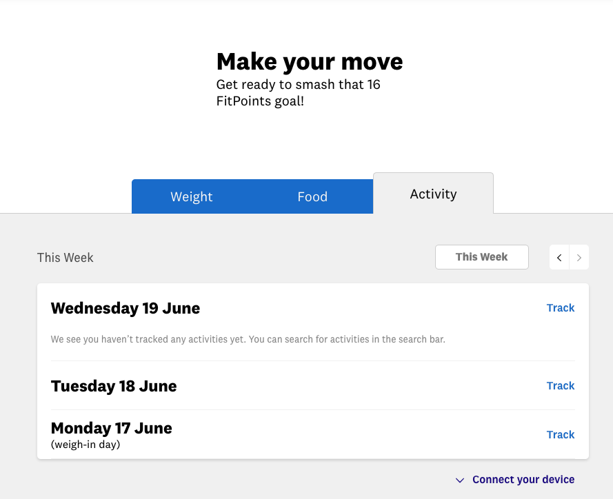
From the bottom of the page here you are also cross-linked into the fitness sections of the site.
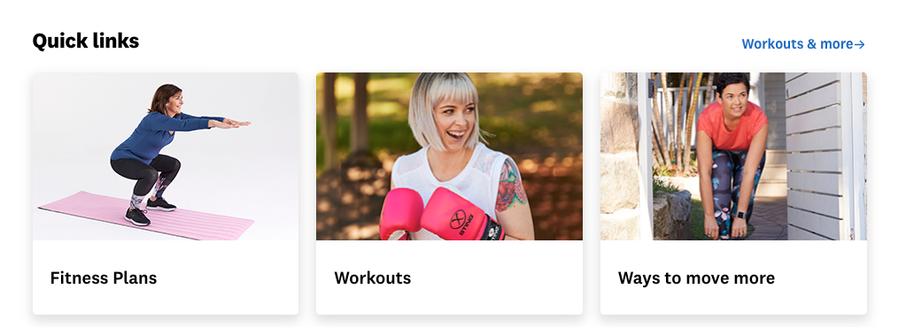
Clicking into the fitness plans here I was taken to a page which has a kick start guide at the top, followed by food plans, before getting to ‘Move downloads’ quite a long way down the page. This initially was a little confusing, where was the fitness plan content I was looking for? This is a bit of a reoccurring theme across the site. All the imagery here is very focussed towards the typical WW core market, women in the 30-50 age range. Given I’ve provided my age and sex, it would ideal if some of this was tweaked to relate to me. It’s also all very white, not really highlighting the ethnic diversity of Australia.
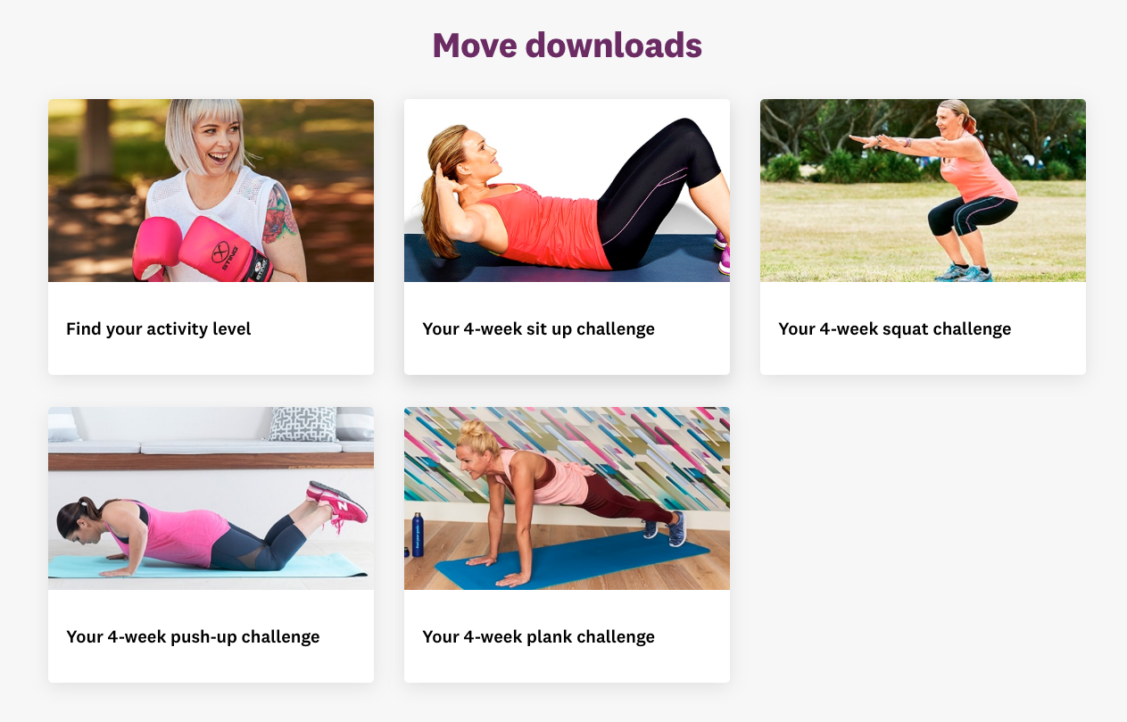
Providing fitness plans is a tough act. There is some reasonable information on here with achievable targets plans, with 4 week focuses. There are also a huge number of sites and apps which provide much more extensive workout information, with video guides and advice. The level of information here was probably relevant for the traditional Weight Watchers target market who are looking to loose some weight, and probably aren’t looking at the other sites and apps out there. However with the new WW target market being around holistic health, there should really be a broader depth and range of information. But to be fair to WW it is difficult to generate enough content, they’re trying to fill a lot of different roles here with food intake, nutrition and exercise.
When you do eventually click on the top nav, a line of secondary nav items appears. I’m not clear on why this doesn’t come up as a rollover state on the navigation, it would be clearer this way that there were additional content categories nested within it.

Also when you are on the Program category page, there are various pages linked to, however these are not broken into the subject categories shown in the second level of navigation. It is more a greatest hits of content mixed together with tiles driving you to categories.
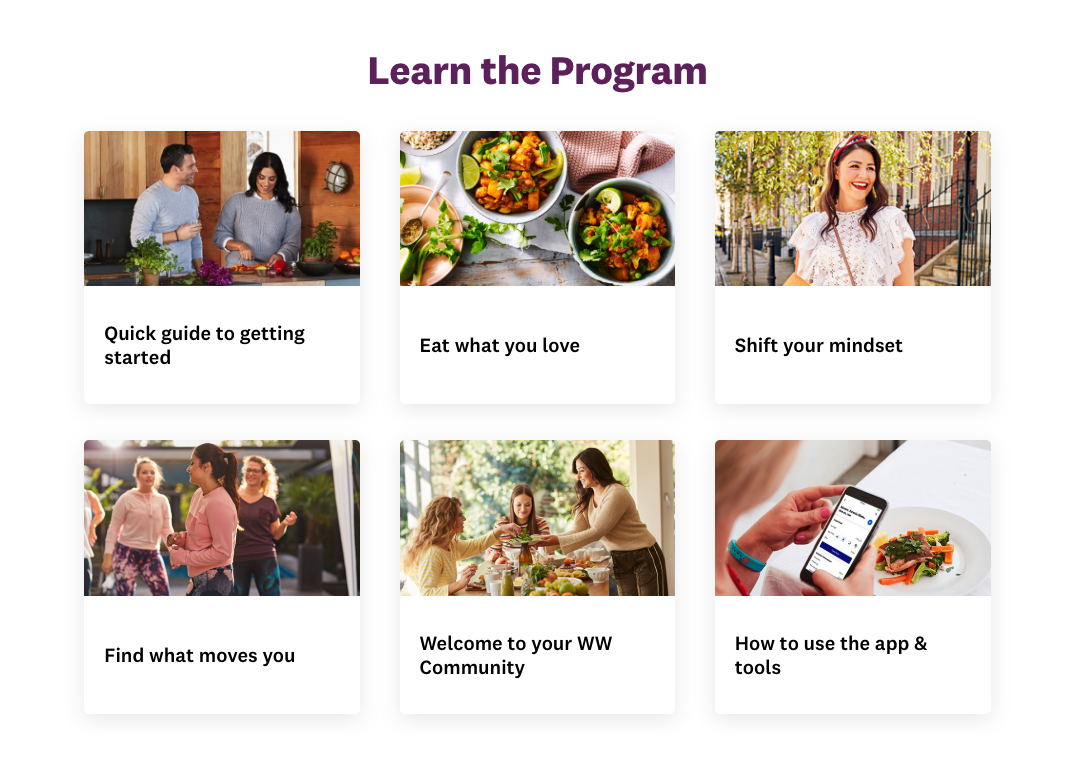
I’m sure WW highlighted the most useful and most read content here, but grouping them together by content, or providing tiles to drive people into specific sections along side 1 or 2 highlight articles from that section would be more straight forward. The Learn the program section is the main part of the page, and this does mix content with categories, but the titles shown under the tiles, and on the page when you click through to it don’t match the titles of the categories in the navigation. I just couldn’t shake the feeling of feeling slightly confused when navigating the site. I think the structure could be more straight forward with a better naming convention, hover state navigation and the use of breadcrumbs.
Jenny Craig Website
When lending on the Jenny Craig site I am greeted by an image of their lead ambassador, Mel B aka. Scary Spice. There is no reference to who she is actually is, just an assumption you will recognise her, or know her from Jenny Craig’s marketing campaigns. Which is probably a fair assumption.
My initial impression of the site is that it’s fresh and clean. The colour palette is light and balanced, there’s also no overloading on the Jenny Craig brand blue. The current special offer is front and centre, and the process of how the programme works is reasonably explained immediately below the main carousel banner, with the key content above the fold.
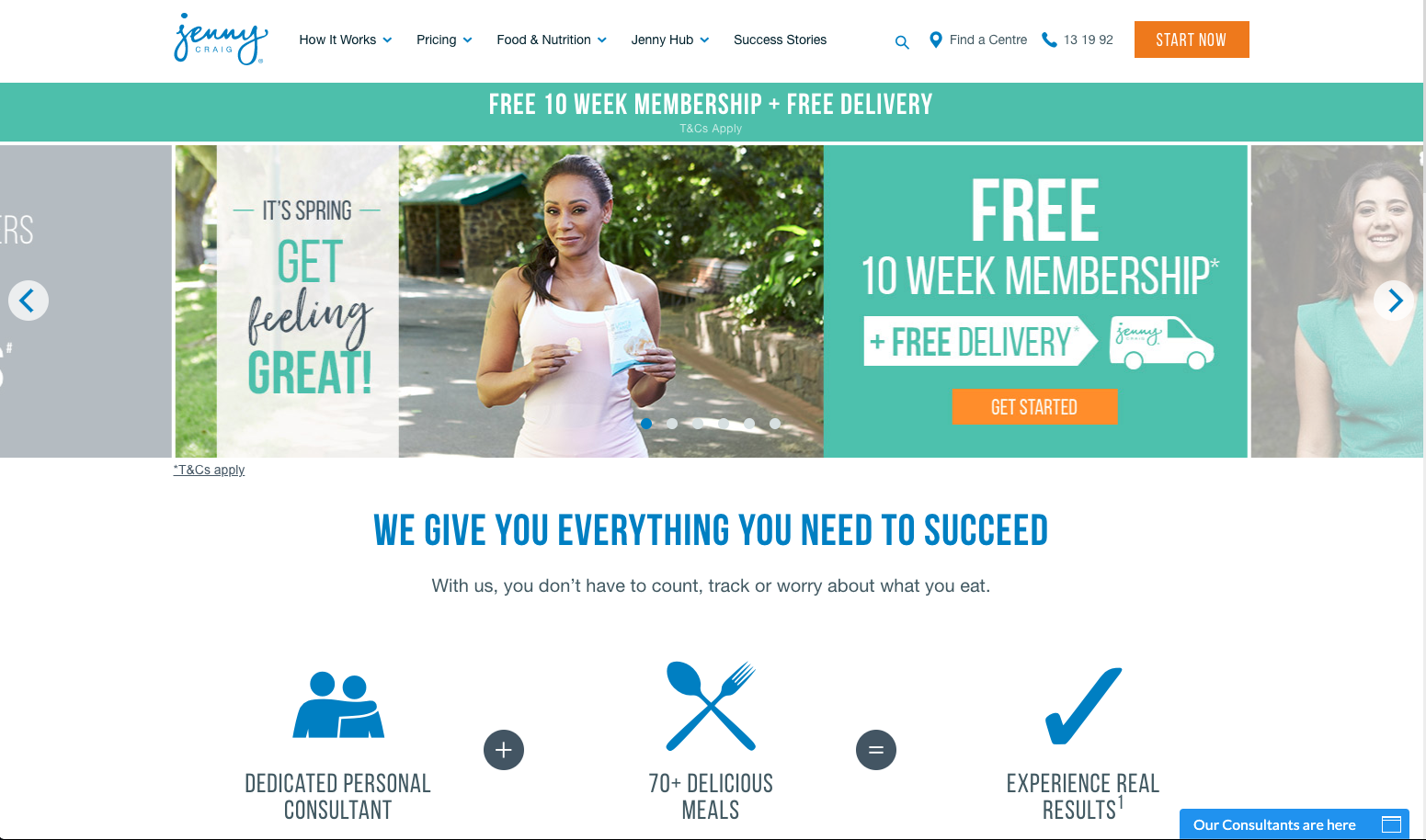
The banner itself is static, so the main message stays where they want it. But you clearly have the option to slide to see additional content. The additional banners highlight member weight loss stories and the new Spring food menu.
There is no hiding from the current special offer on the site. It’s in a reassurance bar underneath the main menu, it’s the main content on the first carousel banner, and it’s then repeated as another static banner immediately below the fold. Clicking on any of these messages takes you to the sign up page.
As you move down the page you then get another member story, with another CTA, followed by some menu examples, another member story and CTA. Then a further CTA with a range of options before the option to sign up to Jenny Craig’s digital magazine. There is also a live chat feature, the team for which was offline at 3.20pm on a Wednesday, which suggests that they are based in the US.
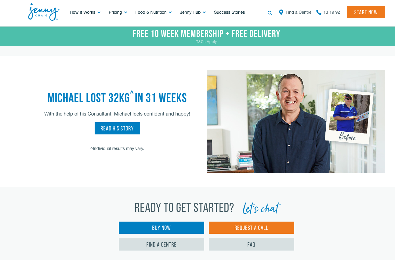
It definitely feels like Jenny Craig have been to their conversion rate optimisation seminar! There are a huge number of CTAs across the home page, with a floating navigation also ensuring that one remains top right just in case you somehow managed to find a section of the page which lacked one.
Most of the CTAs are highlighted in orange, which creates good contrast with the rest of the colours on the page and ensures they stand out.
What the home page doesn’t do is really leverage any in depth content about their ambassador. Other than the image of Mel B, she isn’t mentioned anywhere else and there is no quick way to hear more about her story. Given they are presumably paying her well to be their ambassador, this seems to me to be a missed opportunity to use her as an asset.
Navigation
The top navigation on the Jenny Craig site is much better than on WW’s. There are roll over states for each navigation item, with Success Stories being pulled out as its own section, rather than being tucked under another item as it is on the WW site.

As with WW, there are no breadcrumbs as you navigate the site. However there is less content and I found the site generally easier to get around than WW. I didn’t have this constant feeling of being slightly lost as I worked my way through their content.
Signup process
If I click on one of the many CTAs on the home page, or elsewhere on the site I am taken to their request an appointment form. This is a relatively low commitment step. Yes I will be either meeting with a consultant, or talking to them on the phone, but I don’t need to put it any payment details and at the top I’m reminded that my first 10 weeks of membership will be free.
The process as it is explained is that I will request an appointment, a consultant will then call me to discuss any questions before arranging the in person appointment.

Mel B is used on this page again, this time with a reference to the weight she lost on the programme.
If you’re still unsure about committing to an appointment, and continue to scroll down the page you will get further reinforcement about the diet with some videos on latest success stories, followed by information on what an example days meals look like and then a depiction of how the programme works, similar to the one on the home page but with more information. From here it’s possible to click on the buttons and learn more about the three aspects to the programme. Given you’re just about to book your first consolation the information on the personal consultation is particularly relevant. I think it would be useful to also have a link to this page higher up near the form. People who are unsure about completing the form and what is involved, may not scroll down as far as this.
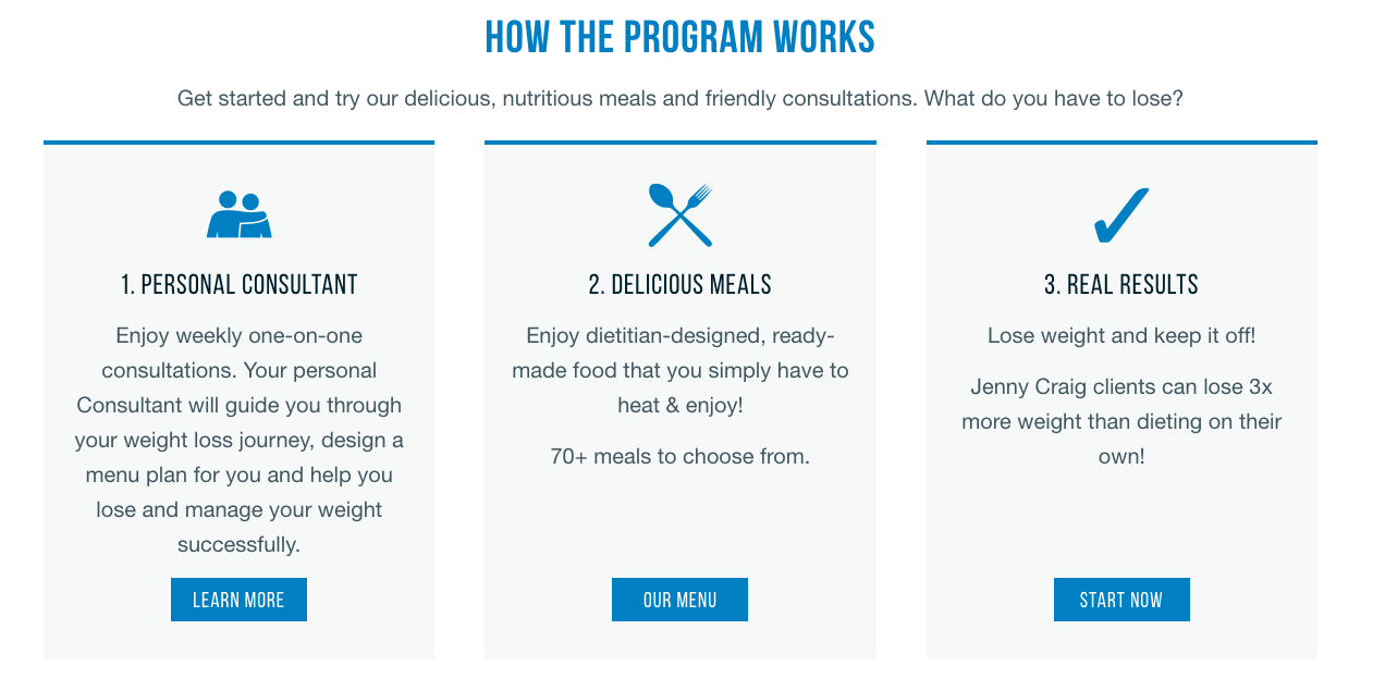
With any lead gen business getting that first form fill and indication of commitment is a hurdle, and I imagine with Jenny Craig this is even more difficult given that potential customers need to commit to a physical appointment. Obviously this is where having a free 10 week membership comes in. But I think this could be emphasised more here with the language they use, making it clear that there is no charge for this appointment and no obligation to sign up at the appointment if you don’t want to.
Interestingly there is also a second version of this sign up page. This is the same page just with a ‘request a call’ headline over the form and no information on what will take place at the first appointment. This version of the page can be reached by clicking on a ‘request a call’ button on the Personal Consultant page I reached from the original sign up page.
Jenny Craig are obviously aware that the act of booking a consultation can be a blocker for some potential customers, so provide a different option, even though this is essentially the process you go through if you arrange to book an appointment.
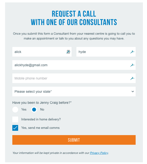
The button to reach this page actually sits next to one to book an appointment. I think it’s fairly clear that Jenny Craig have been doing testing around this sign up process and providing different options to make the process as effective as possible.

There is no logged in area on the Australian Jenny Craig site.
Website Conclusion
The WW site is significantly larger than Jenny Craig’s, with a wealth of functionality and content which is only available once you have become a member and logged in. However the Jenny Craig site is clearer and easier to navigate. Their navigation structure has been better thought through, and overall the site has a more appealing (at least to me) look and feel. Both sites utilise live chat to help resolve any questions you may have, which is great, but beyond this I feel that Jenny Craig have been more active in either testing, or following best practice around generation the best conversion rate.
WW Ambassador programme
Weight Watchers started using Ambassadors fairly early in their growth. Their first ambassador was actress Lynn Redgrave in 1983. Then, as now, a brand ambassador helps broaden the awareness, appeal and strengthen a brands positioning.
WW currently have a wide roster of ambassadors, which helps them appear to different market segments. Bringing on Oprah Winfrey in 2015 was a particular coup. Weight Watchers had approached her several times in the past, her fluctuating weight was part of her appeal to the American public. But during a particularly difficult business period in 2015, Weight Watchers share price had dropped 72% from Jan to October that year, and sales were down 20% in the first two quarters, she agreed to come on board. She helped lift awareness and make the brand cool for the core American consumer, 35+ women.
As well as being the most loved woman in America, she brought with her a social following of millions, bought 10% of WW shares and had a seat on the board – which was above and beyond the normal level of commitment and engagement you see between a brand and ambassador. At its peak Weight Watchers share value had increased 13x in the 3 years following Oprah’s appointment, and her personal investment worth had risen from $43m to $400. In fact, share prices increased 105% within a day of Oprah buying Weight Watchers shares. It was during this period that Weight Watchers started their shift towards ‘healthier, happier lives’, away from purely focusing on weight loss. There is no doubt that Oprah’s endorsement and close involvement with Weight Watchers helped drive improvements over the following couple of years.
WW’s current policy of having a range of ambassadors, has shifted from a focus around one or two key influencers. This is part of their attempt to buy into a wider mass market, and appeal to a more diverse range of consumers – particularly women under 35 and men.
WW’s roster of Global and Australia ambassadors is:
Sam Armytage
Gary Mehigan
Oprah Winfrey – Global
Kate Hudson – Global
Robbie Williams – GlobalInterestingly Weight Watchers first brought on a male ambassador in 2007 in the US, with Greg Grunberg. The widening range of male ambassadors aligns to the shift in public sentiment with more males now being interested in health and weight loss.
With the rebranding to WW, there has been a shift in the type of ambassador WW have aligned themselves with. Kate Hudson is generally not seen as the archetypal Weight Watchers customer. As with many people she has at times wanted to loose some weight, but she is also the face of sportswear brand Fabletics, and as a Hollywood actress does not have the association of ‘carrying a few extra pounds’ which many other ambassadors do.
Kate’s public announcement in association with WW focussed on healthy living and lifestyle, exactly what the rebrand of Weight Watchers to WW was about. Whether this repositioning pays off is yet to be seen, but her involvement has created some backlash with people who have said she isn’t a relevant face for weight loss. Which is, precisely why WW have chosen her – they are looking to move away from the weight loss positioning.
Jenny Craig Ambassador programme
As with WW Jenny Craig has an established ambassador programme. They have a history of high profile ambassadors including Mariah Carey, Rebel Wilson, Brenden Fevola and Mel B. However a number of these ambassadors have been dumped at different times for either not hitting their target weight, or not being able to keep the weight off. This includes; Rebel Wilson, Bert Newton and Kirsty Allen amongst others.
Jenny Craig has also been fined in the past for misleading adverts using ambassador Mel B which claimed you could loose 10kg for $10.
It is less clear with Jenny Craig who their current roster of ambassadors are. Mel B is clearly still on board and used in marketing, but beyond this it isn’t obvious.
Jenny Craig uses their ambassadors relatively lightly on their site. Mel B is only shown in a few images on the home page and sign up pages, and their most recent ambassador Jelena Dokic is only shown on the Jenny Craig blog in three articles, the last of which was 5 months ago.
Given the cost of bringing ambassadors on you would expect that Jenny Craig would be keen to use them more extensively. However its possible Jelena Dokic didn’t resonate with target market and they switched back to using Mel B as the key ambassador on the site.

Ambassador Conclusion
WW clearly has a stronger and it would seem more effective ambassador program overall. They have been able to consistently bring on A grade celebrities and have used them effectively. It’s less clear what Jenny Craig’s strategy is and that so many of their ambassadors haven’t lasted the distance doesn’t reflect well.
WW Email Marketing
There is no apparent pre-sale email program with WW. But given they have never really had a big issue acquiring customers, more with retaining them, this may not be much of an issue for them.
Signup abandonment
Once I got far enough through the sign up process to enter my email address, I was then hit up with an abandonment email, this was a pretty nice prompter to continue my sign up. It links back to their overall campaign with Sam Armytige via both the imagery and inspirational quote, lists the programmes key features and also includes the current special offer – WW appear to always have a special offer. There are CTAs at both the top and bottom of the email so I think they’re doing a good job here.
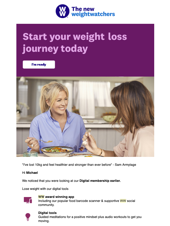
This email was then followed up with a second email a day later. This email has the same content, but by this point I had actually signed up, but this obviously hadn’t been identified. Different content and knowledge that I had actually made a purchase would be best here.
Once you’ve signed up, in my case to the digital only plan, is when the emails really start coming. It’s probably a good pace given the level of commitment you should have if you’re signing up to WW, with a few days being given to you to get your head round the information in the first email before being hit again.
I received:
- Receipt email
- Email on signup
- Email on day 5
- Email on day 6
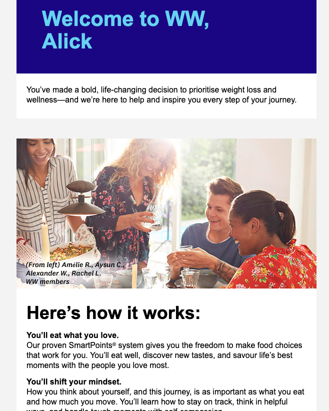
The signup email was interesting. At the top there was this small content which referenced WW Your Way+, but according to the site I am on WW Freestyler. I’m not sure if this was the previous scheme WW were using but it looks like their template needs updating.
would have relevant info displayed. I like that the top of the email uses a photo of WW members and calls this out. It’s a nice touch, these are four real appealable real people, plus there’s a guy in there.

Also the preview in gmail for this email could do with some work.
![]()
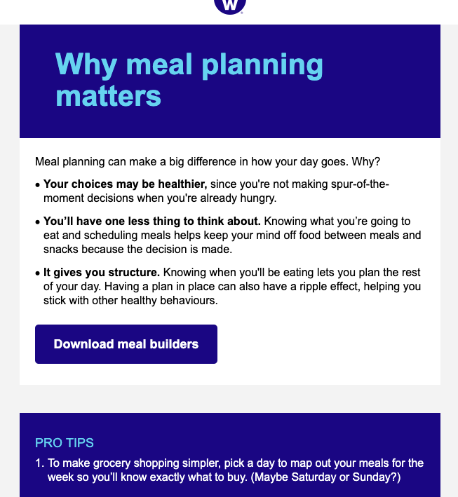
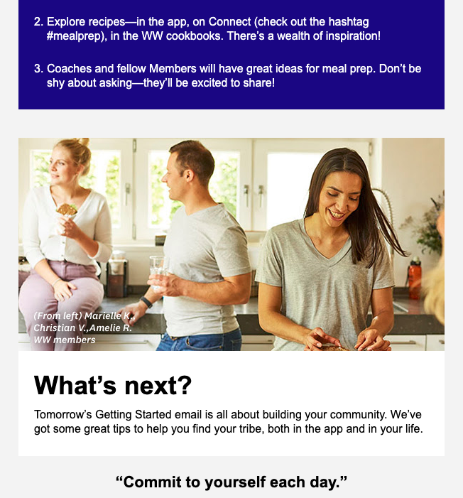
Overall this is a fairly nice email and introduction to the programme, there is some motivation, a personalised intro, an intro to the points system, a push to download the app, and a What’s Next section – which for me is about using the app and checking my email. But presumably here if you had one of the other plans which included meetups and coaching, you would have relevant info displayed. I like that the top of the email uses a photo of WW members and calls this out. It’s a nice touch, these are four real appealable real people, plus there’s a guy in there.
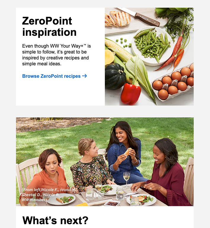
Email no.2 is all about ZeroPoint foods, which is WW speak means foods which you can eat without using up your valuable points. There are 200 of these foods which they nicely provide as downloadable list. There’s a surprisingly large range here, and not just the ones you might expect in fruit and veg, there are seafood items, chicken, legumes and fish. So it would be fairly easy to prepare a meal which used 0 points based on this.
There are also recipes to help you on your (ZeroPoint) way, another photo of WW members and a heads up on what you’ll be seeing in the email tomorrow.
Email 3, as promised is about meal prep and planning. The beginning is pretty dry, just a header and text, no imagery, which you don’t get until you scroll down. This email could do with a bit more love to really make it engaging.
Email marketing
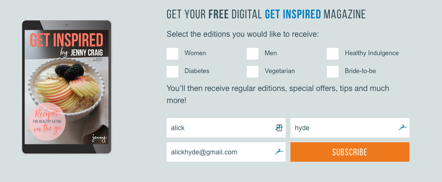
Unlike WW, Jenny Craig have a fairly substantial pre-sale email programme. I signed up for their digital Get Inspired magazine, which I think is a fairly clever spin on a traditional email marketing campaign. Initially I was a little confused as I was looking for exactly thttps://www.shoutdigital.com.au/blog/how-to-setup-and-manage-an-email-marketing-campaignhat, an email sign up option, but I think for most potential customers this is much better than the standard email sign up option, and falls into the box of standard lead gen tools.
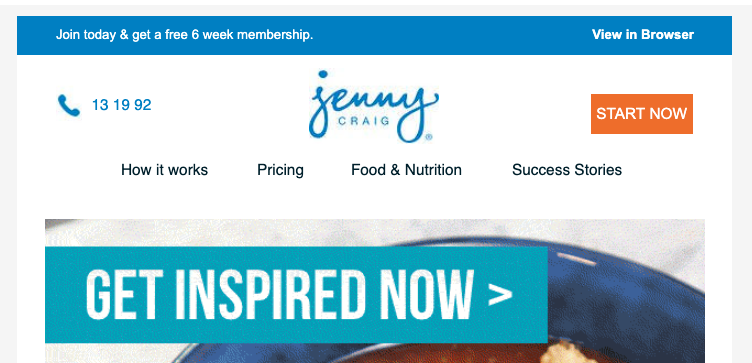
The initial email I received on signup was with a link to the Get Inspired Magazine. The email itself wasn’t that inspiring however. The images in it are extremely heavily compressed leading to artefacts around them which distract from the overall look of the email. There is also an animated Gif, which is also heavily compressed and about of half which appears below the fold in Gmail on my screen.
The Get Inspired magazine itself is pretty good, with the content tailored around the options I selected when I signed up for it. There was some information around weight loss for men, example stories and a couple of food recipes.
However by signing up for the magazine I am now on Jenny Craig’s journey and receiving their marketing emails as well as the magazine. Jenny Craig emails fairly consistently, generally every 2-3 days, with the largest gap I have seen being 5 days.
My first magazine was followed by a more general email the following day. There is an article about a dieticians daily eating habits followed by another recipe and example weight loss story. At the bottom this is a special offer, a banner with a link to winning my dream dress (!!) and a feedback option for the email.
The option to feedback on the email and let them know if I enjoyed reading is a simple Yes/No with a green tick and a red cross. It’s a nice option and easy way for them to gather information on how good their content is beyond just opens and link clicks. However the rest of the content of the email is a bit off target for me. I have previously indicated that I a man, as I said I was interested in the male issue of the Get Inspired magazine. However the content of this email only features women, and at one point gives me the option to enter a competition which is aimed at women, or the smaller number of cross dressing/transgender men out there. Given I have supplied them with information on who I am, this is a big missed opportunity to provide content which will appeal to me.
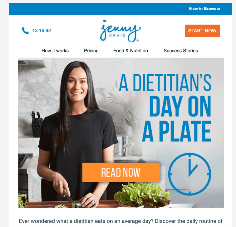
The rest of the emails generally follow this format, promote a specific offer or are for the Get Inspired magazine.
In general the content is pretty strong and relevant to people considering weight loss and joining Jenny Craig.
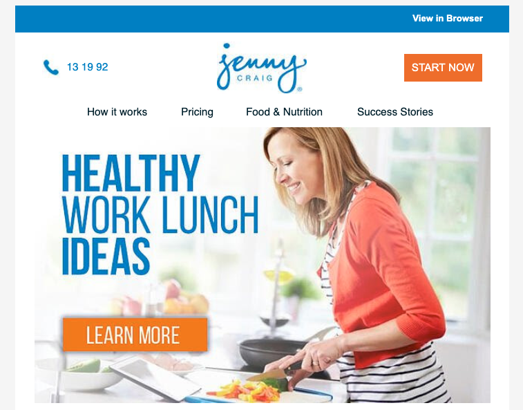
However like WW the email previews for Jenny Craig could do with some work. Nearly all of them reference a Hubspot url.

Email Conclusion
Both WW and Jenny Craig do a reasonable job with their emails. However there is considerable opportunity for further personalisation with the information they have. The visual quality of the email themselves is also hampered by the level of compressions applied to some of the email assets.
The WW App
After using the site I was thinking that the WW’s focus would have been, rightly, on the app. This is where we would expect most people to interfacing with people on average in Australia using their smart phone for over an hour every day.
Initial impressions of the app are good. The entry screen is a slick video and as good as any other apps which I’ve seen.

Here it is possible to find out more about WW and the programme, and sign up completely on your phone. The experience is at least as good as on desktop.
Once I had signed in I was given a short tutorial on the key elements of the programme, before being shown how to read and use the dashboard.
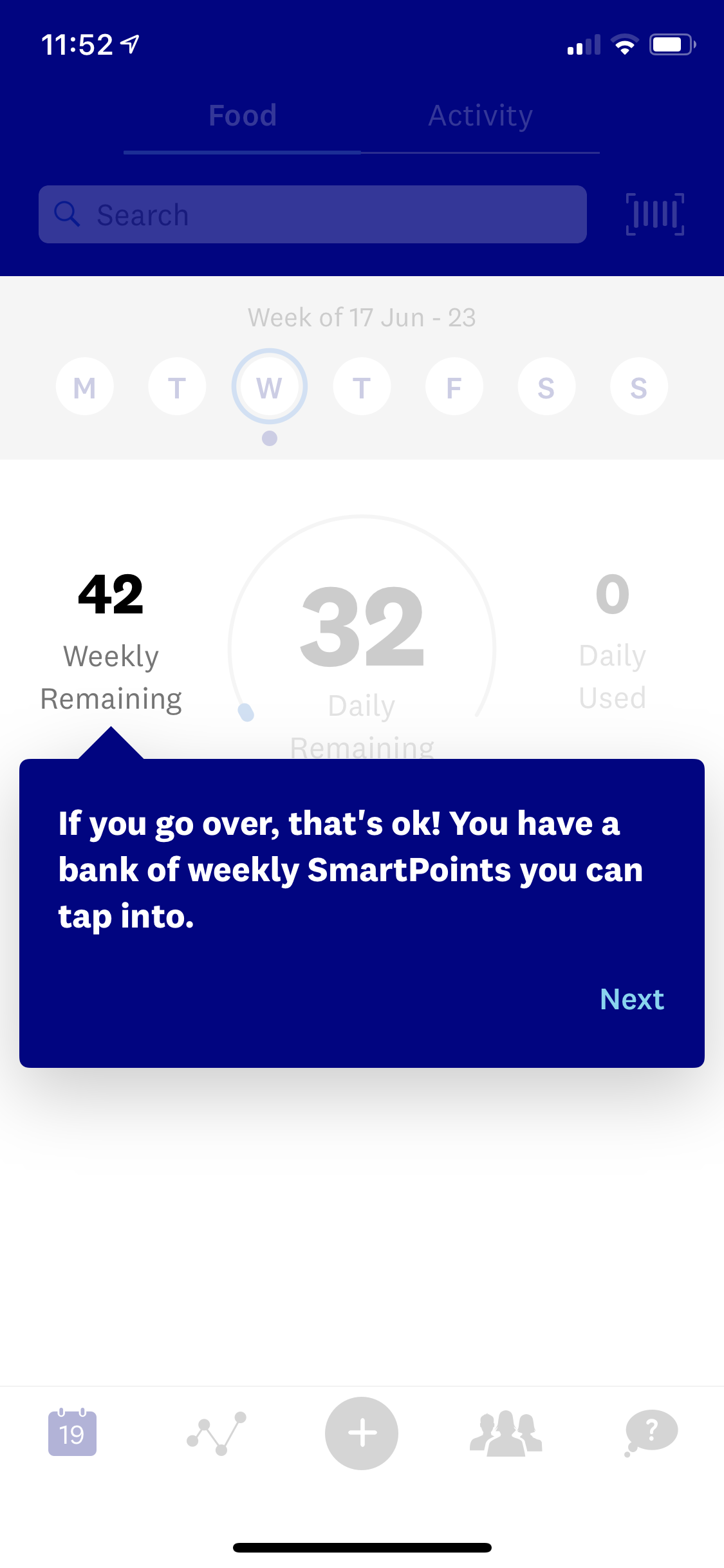
This where the fairly slick experience fell down. Once I completed the guide I was left on the search bar, from here there didn’t appear to be any way to exit it except to click on, or search for a food type and log it at a meal. I doubt this was deliberate and it’s not a good experience. Once that was complete the app user guide started up again.
After this initial hickup, the experience on the app is generally better than the site, as I suspected it might be. Most users will probably default to using the app as its with you all the time on your phone.
The dashboard itself does look a bit better on the phone (mobile first?) and includes a guide as to what day of the week it is, and allows you to easily jump around to record your food and activity on different days. However it still doesn’t give you a guide as to which days you have logged information on. I think a nice guide here would be to have the days in the past highlighted, maybe with the circle filled up part or all the way to indicate you used all or only part of your points on that day.
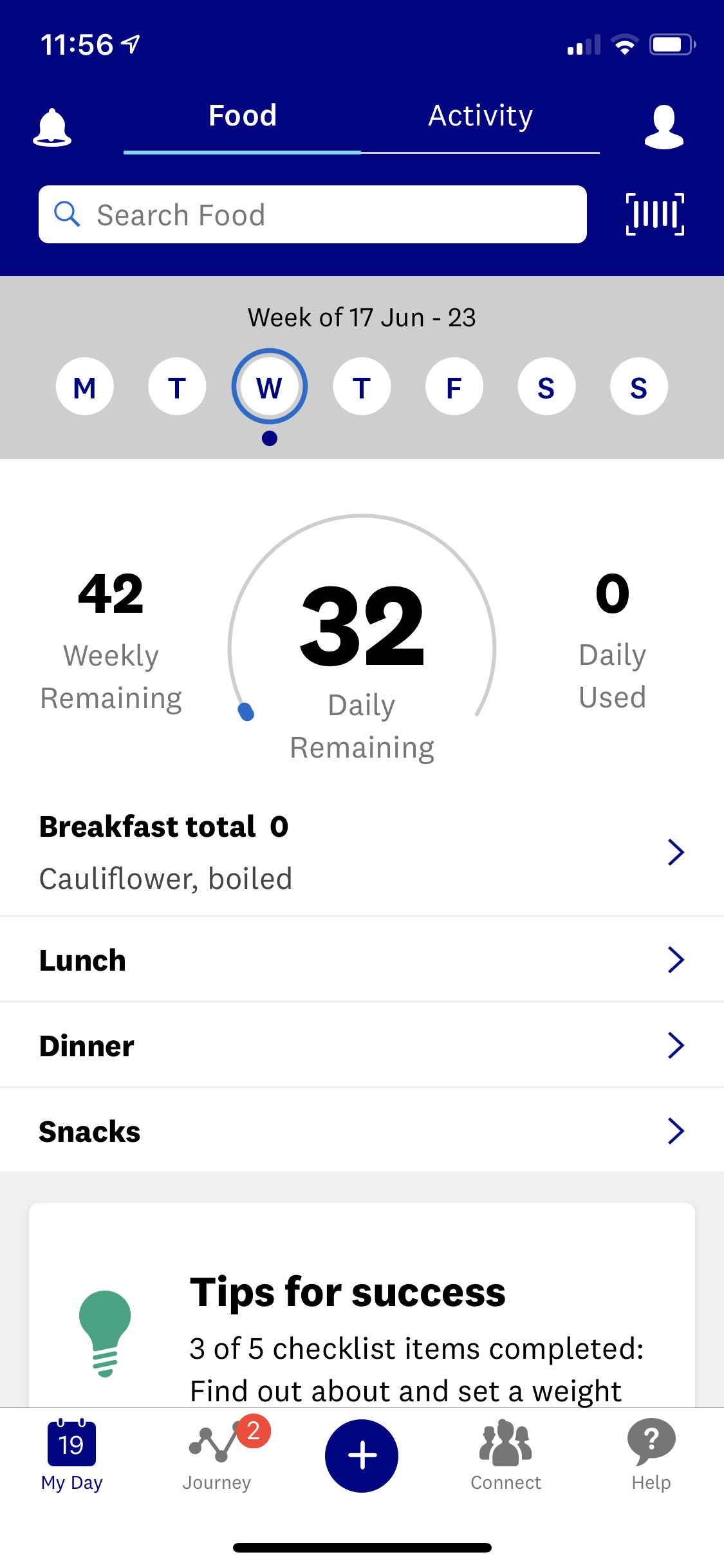
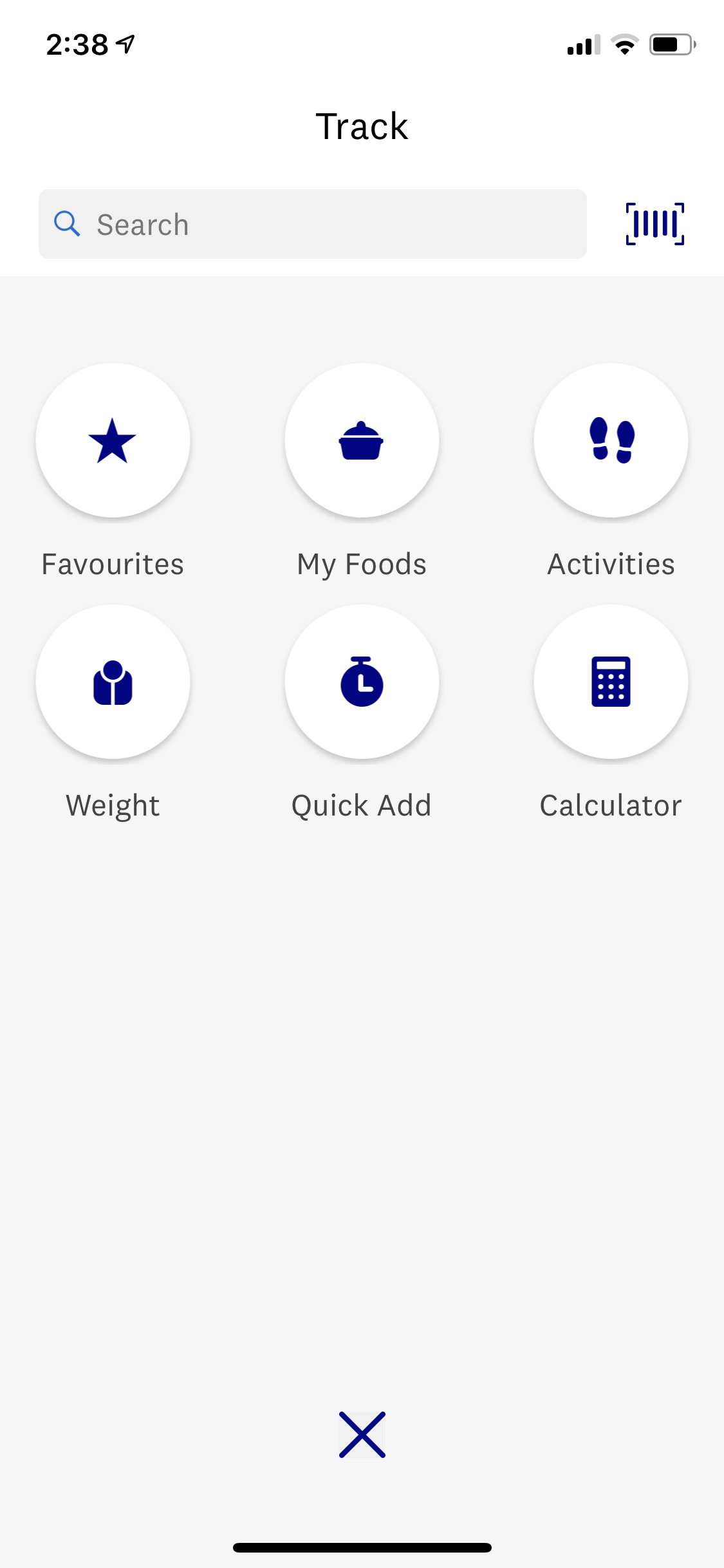
The weight section is removed from the My Day dashboard and sits under journey, which makes sense as its here you can also see how many days you’ve been food tracking. But all info can also be added by just hitting the blue + symbol in the middle at the bottom.
It’s also within the app that the Connect social media platform comes out. When you’re logged in via your browser on a desktop/laptop this is a little hidden away and you need to actively click ‘Connect’ in the navigation. Once there it’s a little like using Instagram in browser, it works but it just feels wrong. On the app you stumble into it as soon as you start scrolling on the My Day screen, with trending posts appearing. If you actually access the Connect section on the app you get it in its full glory. With the whole experience being a little like you are in the home view on the Instagram app, but seeing recommended content rather than people you’ve followed, which I’m sure isn’t accidental.
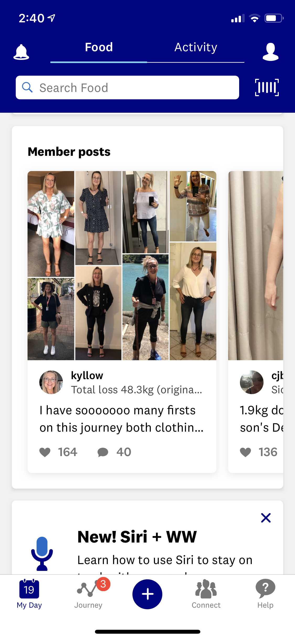
Overall the experience of Connect is pretty solid and it’s easy to get sucked into looking at people’s before and after photos and talking about their ‘journey’. It all seems pretty supportive and there’s lots of cheering on from members to each other. You can search by hashtag and follow specific members to keep up to date on their photos. You can just share a text post, but as with any social network it’s really all about visual mediums. Clearly there are a huge number of members posting regularly and it’s helping some members keep to their targets and stay motivated.
From the My Day section its also fairly easy to navigate into the recipes, of which there appear to be over 2,000. It’s also possible to favourite recipes and save your own within the app, a nice touch to help keep the app sticky around meal times.
App Conclusion
Jenny Craig doesn’t offer its client an app. So there is nothing for us to compare here. However, with a couple of small hickups, WW offers an extensive, immersive app for their member experience which nicely integrates their private social media platform Connect.
WW Organic Search
Weight loss, diets, and healthy living is a competitive multi billion dollar industry worth $6.6billion in 2013/14 in Australia alone.
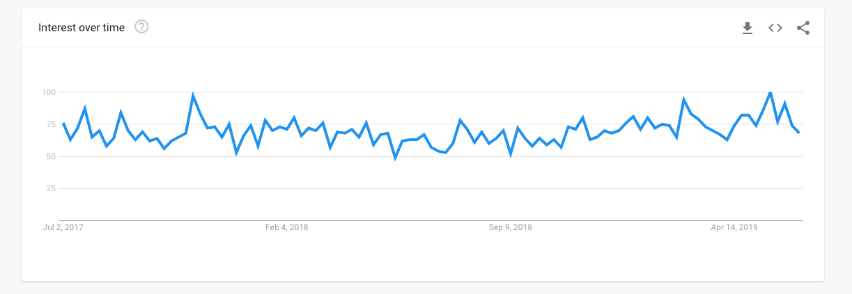
That said, search term trends show limited growth, with the Google trends for diet only increasing slightly over the 5 years, and trends for terms like diet plan & weight loss being fairly static.
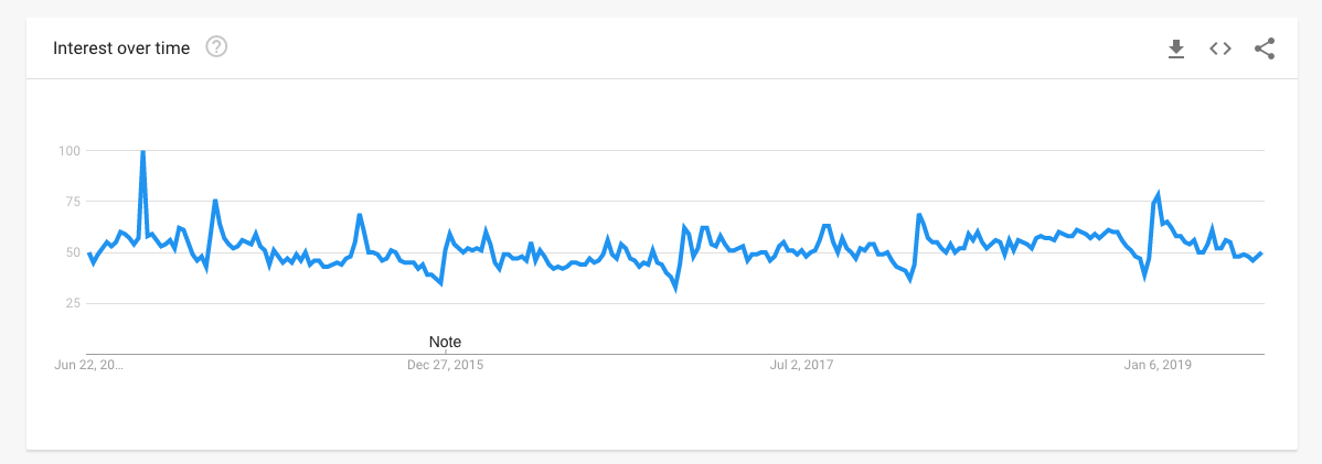
As with any business, Weight Watchers can rank for two types of keywords, Branded and Unbranded.
As the largest Weight Loss and diet scheme in the world you would expect brand searches for the term Weight Watchers, WW, or variations of this to be a major driver of traffic for WW.
Perhaps worryingly for WW trends for the term Weight Watchers have nosedived in Australia since 2010.
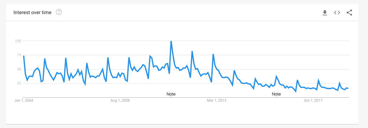
And there has only been a small uptick in searches for WW when we look at trends over the last two years.
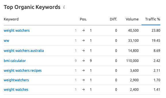
Looking at WW’s top organic keywords in SEM Rush we can see brand keywords are strong sources of traffic, but bmi calculator also pops up as a major traffic source.
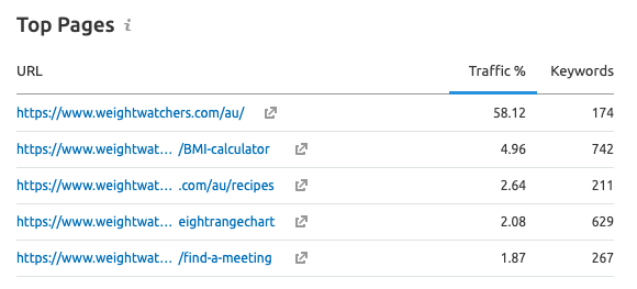
WW’s top landing pages reflect this, with the home page taking almost 60% of traffic, and the BMI calculator page coming second with very close to 5%.
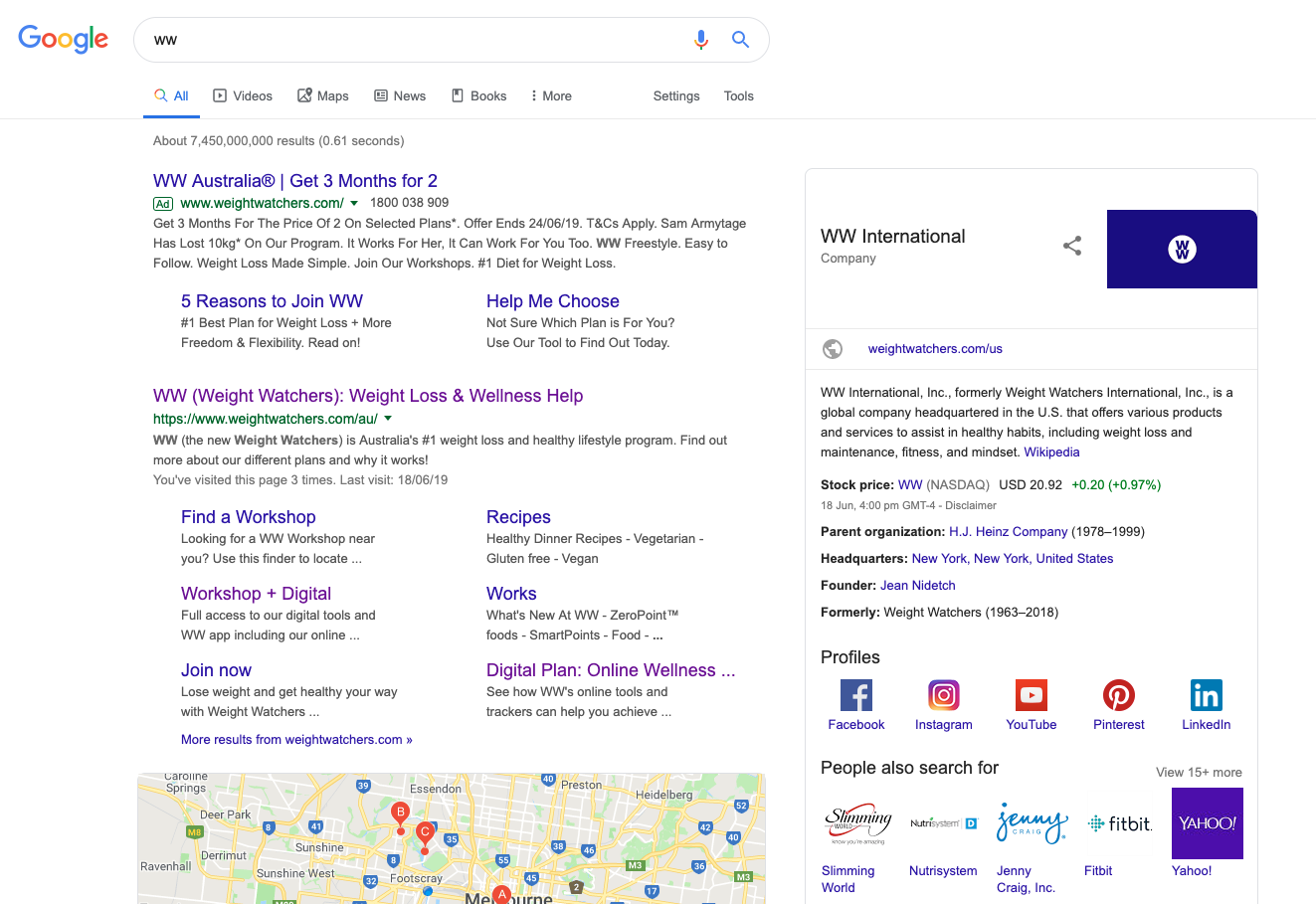
Impressively no one even gets a look in in Google for the search term WW, with paid competition only popping up at the top of page 2.
They aren’t quite as strong on the term Weight Watchers, but they still own the top organic spots and Google Map listings.
However when it comes to generic search terms WW are not in the same position. They have 152 no.1 positions and 560 1-3 positions. This seems like a huge number, but when you remove the BMI calculator search terms most of these are fairly low traffic search terms. Prawn sushi roll recipe anyone? They do not rank on page 1 for key search terms like weight loss, diet plan, dieting or weight loss Australia. Most of these rankings are occupied by news outlets, and government related sites. Most of the generic search terms which WW rank for are recipe related, and while ranking for any search term has some value, you have to question what the long term benefit of ranking no. 2 for the term chickpea patties has been.
Given the drop in searches for their branded terms, you would expect that they would looking at generics to pick up the gap, and while this may have helped, I don’t see it driving the relevant traffic which they would need it to.
Organic traffic estimation
How visible a site is in search, and the amount of organic traffic it receives is a reflection of its current ranking for search terms, which are themselves a reflection of the on-site optimisation (content, site structure) and back link profile of the site.

When looking at the traffic estimation for WW we can see a really huge jump in traffic in October 2015. This coincides with the introduction of Google’s Rankbrain algorithm which uses machine learning to sort results. It is believed that this puts search queries through an interpretative model to apply factors for the individual searcher such as location, personalisation, and search query words to determine the searchers true intent. At the time Google stated that Rankbrain was no.3 in terms of importance in the 200 or so factors they assess, so this represented a major change to the way sites were ranked – and WW clearly benefited from this.
Organic traffic growth from 2015 onwards is steady but good, increasing by almost 3x over almost 4 years. There have been sudden dips and smaller increases, but these are consistent with what you would expect to see over the longer term with a competitive but successful business.
Competition
Unfortunately for us, SEM Rush sees WWs main competitors in organic search as health food recipe websites. This prevents us from getting an understanding of how WW ranks against their true business competitors such as Jenny Craig, but it shows how the search performance of the recipe section is skewing the ranking of the site to the extent that it is viewed as a recipe focused site, not a dieting or general health & wellbeing site.

Keyword Gap Analysis
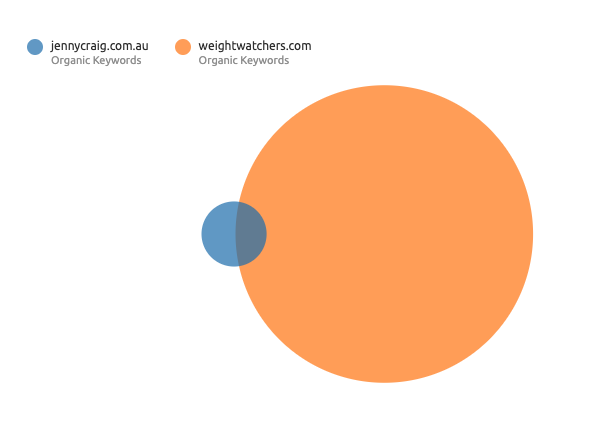
When we look at Weight watchers compared with Jenny Craig, Weight Watchers comes out significantly on top.
For Jenny Craig, reviewing this would be important for them to understand what keywords WW are ranking for which are they are not. This information can then be used to help shape your future content and search strategy.
Backlink profile
For those who’ve spent time working on organic search before, you’ll know how important backlinks are. Organic search is essentially 20% on site, what content, keywords we have, and 80% off site, what backlinks we have coming to the site.
Backlinks from other sites, are important for several reasons:
- They are an indicator of trust. If a site is linking to you, that suggests that your site has some value, especially if you have hundreds or thousands of sites linking to you. But volume isn’t always everything. The quality of the sites that are linking to you are important. For instance, a link from the Sydney Morning Herald is going to be worth more than a local blog which receives few visitors.
- They can help Google find new pages on your site. Google will find pages on your site assuming you have linked to them internally, but if there is an external link to the page it will speed up how quickly Google finds and indexes your page.
- There may be some gains in referral traffic, if for instance, the link is from a site with lots of traffic like the Sydney Morning Herald.
Links can also have a negative impact. Toxic backlinks as they are called, are when sites which are seen as having a low value, or cover a content subject completely unrelated to yours link to you. If these links build up, then they can actually have a negative effect on your search ranking.
Now when we look at weightwatches.com in Ahrefs they have some significant backlinks. With 1.4 million links coming from 25,100 different domains.
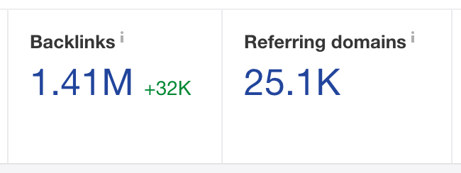
This strong backlink profile explains their strong performance in search, and while we are looking here at links to the .com domain, not the .com/au pages we are automatically redirected to in Australia, the benefits of the backlinks to the domain will be felt across the rest of the site to reasonable extent.
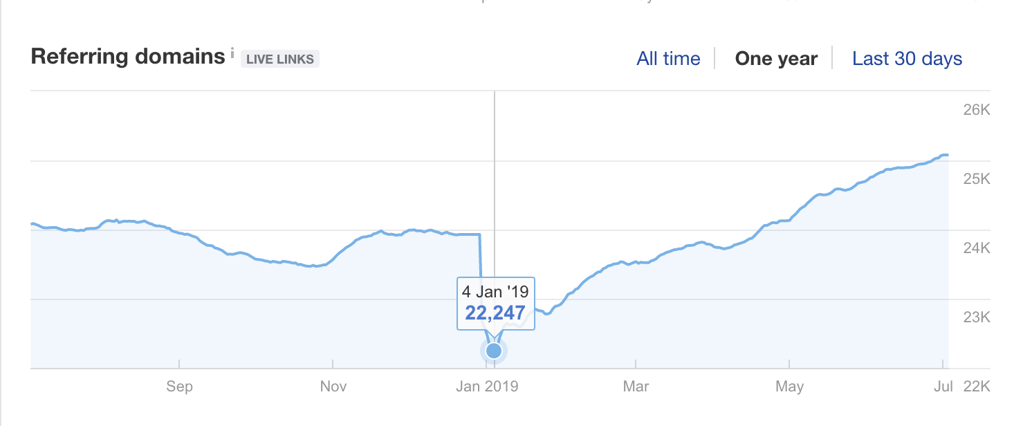
If we look at the referring domains over the last year there is a significant drop in January 2019, followed by a consistent upwards trend. This suggests that a substantial backlink disavow was done in January to remove toxic backlinks, followed by an ongoing campaign to generate new referring domains.
Generating backlinks is generally done through actively developing content which is useful to people. However you can also more actively build backlinks through an outreach campaign, where you reach out to blogs and sites to request links to you, often in return for providing some useful content or an article for them to post.
Any company which has had a content campaign will tell you that it is extremely time consuming, but add in actively outreaching to new sites and the resources to manage this on the scale which WW are doing would be substantial.
Anchorlink profile
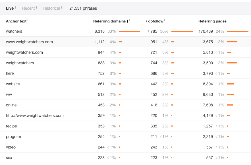
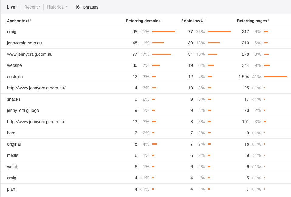
If we move on to looking at their anchor text, we can see that branded terms make up 7 of the top 10 anchor terms, with weight watchers being way out in front.
Serpstat have argued that Branded Anchor text should only make it up 50% of all anchor text. This ensures that Google does think that your backlinks look to spammy, and lower your search ranking as an effect.
The total of all WW’s branched anchors is around 50%, so ticks a box as far as Serpstat are concerned. We would however argue this figure really needs to be taken on a case by case basis, and that some large online retailers will see a higher branded anchor text percentage, but still achieve extremely strong search results (see our blog/case study on Repco).ˆ
Overall WWs anchor profile looks very natural, until we get down to the 13th most used anchor text. Having sex as an anchor definitely does not look natural, has no relevance to WW site and will be having some impact on their rankings. Taking some actions to complete a disavow file and remove these backlinks from Google’s index would be beneficial here.
Jenny Craig Organic search
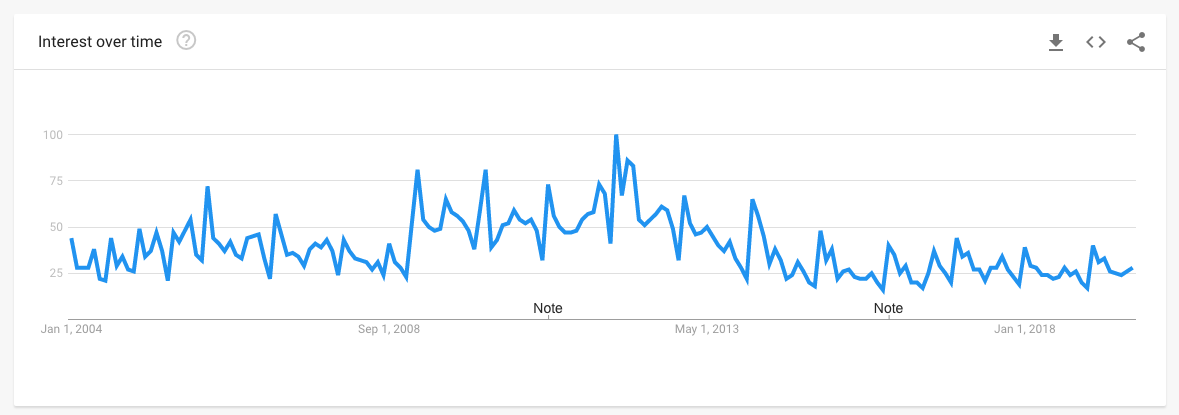
If we look at Google Trends searches for Jenny Craig have also dropped off over the last five years.
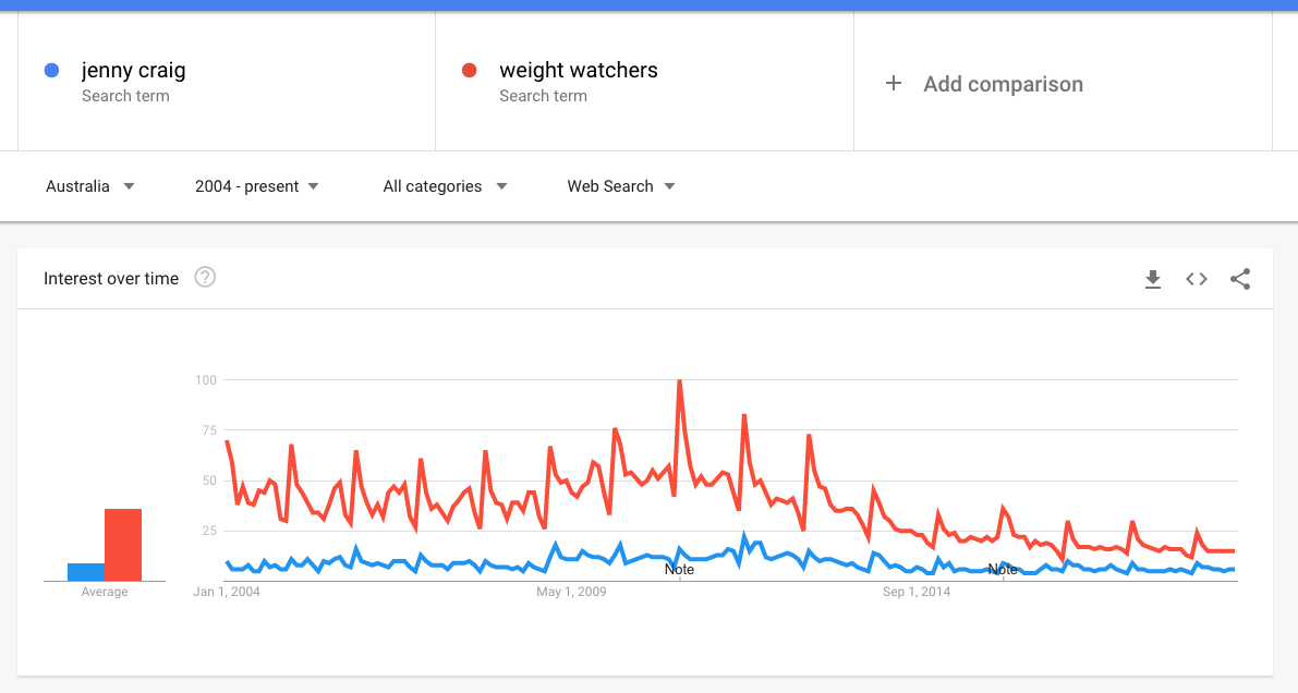
But if we compare WW to Jenny Craig we can see that WW has suffered a significantly larger drop off in search volume, although it is still out in front compared to Jenny Craig.
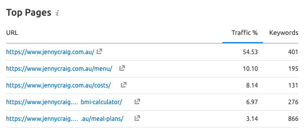
If we look at their top organic keywords they are fairly similar to WW. Brand focused, but with the BMI calculator and BMI also appearing as key drivers of traffic, despite both being on page 2 of Google.
Their top landing pages reflect these keywords. But we see a slightly more spread of traffic to WW.
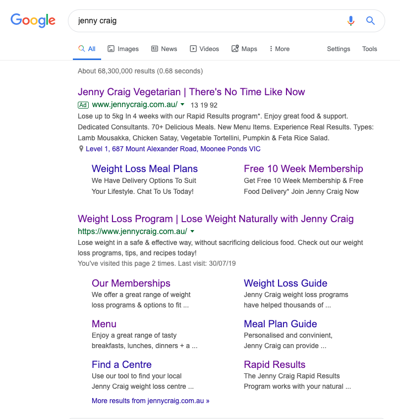
Jenny Craig also dominate Google for their brand name, although not quite as impressively as WW, with two non-brand sites coming up at the very bottom of the rankings.
When we look at generic search terms Jenny Craig only has 6 top search terms ranked 1-3, most of which are extremely low traffic. They also have only 99 search terms ranked 4-10. They do rank on page 1 for some relevant search terms for them such as weight loss food delivery and weight loss meal delivery, but as they are not in the top 3 positions these are not driving large amounts of traffic. Easily the best of these is weight loss meal plan, which they are ranked no.10 for and SEMrush predicts is giving them 243 visits per month.
Organic traffic estimation
If we look at Jenny Craig’s organic traffic estimate we can see that traffic has actually decreased from May 2018 and it currently only slightly better than half it was then.

If we drill down further and just look at generics the situation is even worse. The drop off here is truly significant, with traffic dropping from over 25k a month to just over 5k now. I am sure this is of significant concern to Jenny Craig, and suggests that either they have been heavily penalised by Google, or some other change from Jenny Craig’s side has impacted their search visibility.

If we look at total organic traffic, with Jenny Craig we don’t see the same jump in traffic from Google Rankbrain in October 2015 that WW received. However when looking at the generic traffic only we definitively see a jump, with traffic increasing almost 4 times from 1,309 in September to 5,915 in October.
Jenny Craig benefited significantly in January and February 2017, when Google introduced algorithm updates targeting private blog networks, and another which penalised mobile sites with popups and overlays which covered the main content.
Further rapid increases for generic traffic in early 2018 didn’t coincide with any clear algorithm updates, but tools such as SEMrush record that there was a lot of activity going on within the Google Au database. Unfortunately for Jenny Craig these improvements were nullified in late 2018 and early 2019.
Competition
Unlike WW, SEMrush does provide us some useful information with the competitive positioning map. Not all the competitors are relevant, but befitfood.com.au and dietlicious.com.au are both providers of diet food meals.
The Competitive Positioning Map is a data visualisation based on Jenny Craig and its competitors’ organic traffic, as well as the number of keywords that they rank for in Google’s top 20 organic search results.
From this we can see that jennycraig.com.au is clearly outperforming in organic search compared at least to these two competitors.

Keyword Gap Analysis
As we’ve already seen, Jenny Craig is not ranking anywhere nearly as well as WW. However what how do they do against the previous competitors SEMrush identified?
In the ven diagram below we’ve also included liteneasy.com.au. Here you can see that Jenny Craig is just edging out liteneasy on keywords, and both are ranking for significantly more keywords than dietlicious.com.au and befitfood.com.au.
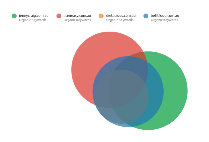
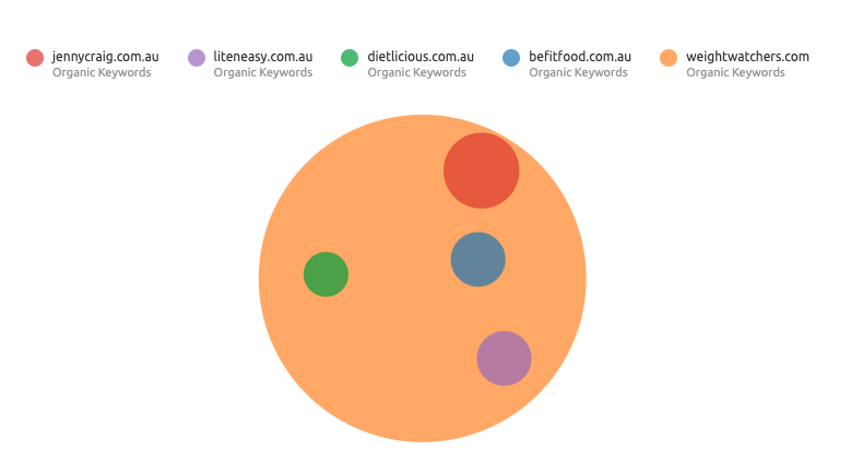
However, given what we know about how many generic keywords Jenny Craig is ranking for, this suggests that none of these sites are doing an amazing job. If we include WW as well, you can see how totally insignificant their rankings are.
Backlink Profile
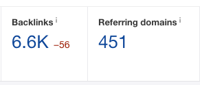
If we look at Jenny Craig’s backlink profile in Ahrefs we can see that they have a reasonable number of backlinks, however this is just tiny in comparison to WW which helps to explain why they are performing so badly in comparison in organic search.
If we look at referring domains, there is a large drop in January 2019. Which broadly coincides in the drop in generic search traffic. But interestingly also coincides with the drop experienced by WW. The drop is less significant for Jenny Craig, but that they coincide for two businesses in the diet/weight loss industry suggests that there is something more significant than the businesses undertaking a toxic backlink disavow.
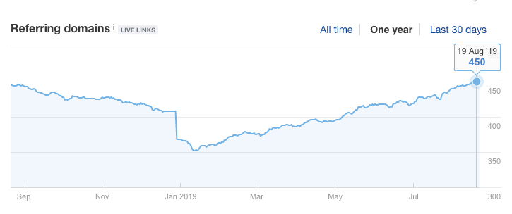
Reviewing data for lietneasy in Ahrefs as well shows a similar, if again smaller drop at the same time.
Anchorlink Profile
When we look at Jenny Craig’s anchor link profile, we can see that branded anchor links are roughly 57% of the total anchor text. As we’ve already mentioned this is above the 50% which Serpstat recommend, and could do with balancing.
SEO Summary – Needs to be revised to include Jenny Craig
Upon review here are the top 10 items Weight Watchers could implement to significantly increase organic traffic.
It would be advised that Weight Watchers actioned some of the follow off page optimisation strategies to boost performance
- D0 a targeted outreach and link acquisition strategy to boost links to inward pages
- Co-ordinated with PR to create link building strategies that created high volumes of organic links to tools on there site
- Leveraged there community blogs as a link attraction tool
- Leveraged tools for a much higher volume of long tail keywords
- Implemented a calorie counter onsite. There is huge traffic for “calories in” keywords that could generate tens of thousands of search phrases per month for weight watchers
- Tightened on page optimisation by building an internal linking architecture
- Corrected minor coding issues to help with page quality score and speed optimisation. This would help search but it would also reduce bounce rates, and in turn help with conversion rates
- Picked keywords that are on page 2 and lifted to page one. This would establish a strong quick win strategy and drive fast traffic growth for weight watchers
- Increase volume of landing pages across the site. Adding landing pages for diet plan, diet programs, fitness plans, weight loss diets would drive targeted organic traffic and would be stronger as an integrated search strategy. Currently, Weight Watchers is purely bidding on these terms. With organic also ranking for these terms in the top three which is highly likely with the strength of the domain, it would lock up more click share for Weight Watches and also create stronger barriers to entry in the search space making it difficult for apps and pure play online only communities to get as strong a return on ad spend through search
- As Weight Watches has a strong brand in-market they have been linked to very naturally. With brand related anchor text sitting very highly in its link profile.
WW Social Media
As we’ve seen WW have their own social media platform in Connect. But this is for members, so lets have a look at how they are using social media on the general public platforms.
While WW have accounts across Pinterest, Twitter and YouTube as you would expect, it is on Facebook and Instagram that they are more active so we’ll focus our attention here.

Facebook is WWs primary social media platform and the content they share has two main purposes:
- Inspire potential and existing members through other WW members weight loss journeys
- Share content on recipes and exercise tips as part of a broader content marketing strategy
Facebook’s profile photo, as with most brands is their logo. Before diving into their marketing and platform I can’t say I would have recognised the logo, but expect it has resonance within their core target market.

Their cover photo is a good montage of images. It delivers a key marketing message which both covers off the wellness message which is intrinsic to their current positioning, but also highlights the weight loss aspect of what they offer. They’ve included a range of members here, including both an ambassador and a real male and female member. What’s interesting here is that they are not highlighting the more substantial weight losses made by some members, but relatively more moderate weight loss. I would argue that while less dramatic, this is probably more appealing to the wider market. While Australians have increasing levels of obesity, the reality is that most people are not looking to drop 45 kg, but something more moderate to make them feel better and healthier about themselves, which ultimately comes back to the wellness message of this banner.
A video here probably would have been more effective but I still think this is a great cover banner (if over compressed).
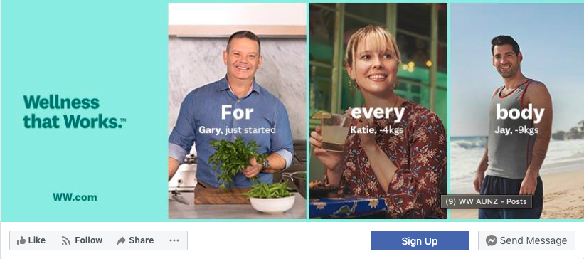
As with most brands they are using the sign up feature on Facebook, which is being tracked, as it should be, with a UTM tag so WW can attribute signups back correctly to Facebook.
Interestingly WW Australia does not seem to be taking advantage of Facebook’s Global Pages Feature. This allows international brands to provide localised versions of their pages for different countries, but sharing a universal name, followers and to have a vanity URL. I imagine this is to do with the company structure itself and how they operate.
WW are also not using the messenger page option which causes the messenger to automatically open when people arrive at the page. This is useful to divert customer service queries into a chat, rather than leaving negative feedback as a post on your page. Obviously, this is only really manageable if you have a real customer service team at the ready to respond in a reasonable time frame – no one is more impatient than an annoyed customer.
Post Content
This breaks down into:
- User Generated Content
- Link posts – back to blog posts or recipes
- Video content – recipes or brand content regarding their ambassadors
- Promotions – rarer, but for specific products like the WW cruise
User generated content
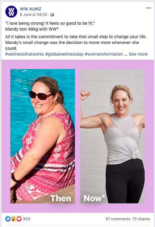
Havingtheir own private social media network Connect, there is no end of UGC content which WW has access to. And they use this selectively on their Facebook page, lifting member posts, usually before and after images and reusing these to promote what WW can help people achieve.
There is obviously something immediately relatable in seeing a real person who has shed pounds on the programme, and it’s a tactic you see across fitness and wellness companies in marketing, both digital and traditional. Unsurprisingly this content gets the best engagement from all the posts WW make.
Link Posts
WW post several different types of content which links back to their blog and site. The posts cover recipes, exercise and general tips.
These seem to have limited engagement, but the main value of them to WW is probably in getting a click thru to the website, and engagement with the article there.
Most of the time WW are using the link preview feature, which was developed by Facebook to make it easy for brands to share links and to be as conversion focused as possible. There are times however when WW just post the image and include a bitly shortened link with the copy.
WW should be using UTM tags here to track on which posts and campaigns generate the most engagement and conversions on their website. It’s not possible for us to tell if they are doing this due to the shortened link, but in our experience it’s only the most organised and well staffed brands which are using UTM tags to their most effective extent.
Video Content
In general I found the WW video on Facebook a bit lacking. There is not a lot of video content, only 1-2 posts per month, and much of this is recycled brand video – like the content around Sam Armytage becoming an Ambassador.
One of the better videos was an accelerated recipe video of a chocolate cake baked in one of their WW silicon steamers. Text overlays are used here so you can watch the video without sound, which is what most Facebook users do. This ties into their broader strategy around recipe generation and was reasonably engaging to watch.
The real missed opportunity here is to leverage user generated video, or to feature members more heavily in video. Given that we know video gets 20% more clicks than an image (thanks Hubspot https://blog.hubspot.com/marketing/to-video-or-not-to-video) and generally better engagement, this is where I would be putting my investment.
By using limited amounts of video content WW are also missing out on a chance to build Engagement Custom Audiences from video views. With video it is possible to build an audience based on the people who have an engaged with the video. This would allow WW to retarget people who had engage with a specific video. While retargeting based on image engagement is possible, it is not as targeted and is limited to ‘people who engaged with any post or ad’. So for general marketing this is ok, but if you want to get super granular with your messaging and targeting it is more restrictive.
Promotional Content
There is fairly limited promotional content on WW’s Facebook page. By this I mean, content which targets an actual sale or conversion, rather than just providing information and adding to the community. WW appear to be avoiding this in general rather than trying to push signs ups or sales of products from their store. In general I think this is the correct policy, usually sales via posts to your own page a limited unless you have a specific sale or special offer taking place. Hopefully this is based on actual testing by WW rather than a gut feel.
Community Management
It’s pretty much a given for brands these days that your social media channels, especially Facebook, are an extension of your customer service team. WW are responsive and active on their page and clearly get back to comments from customers pretty quickly, within an hour in most cases.
General best practice is to steer away from having conversations with customers on their posts, and move conversations onto messaging or email. WW seem to only be doing this some of the time.
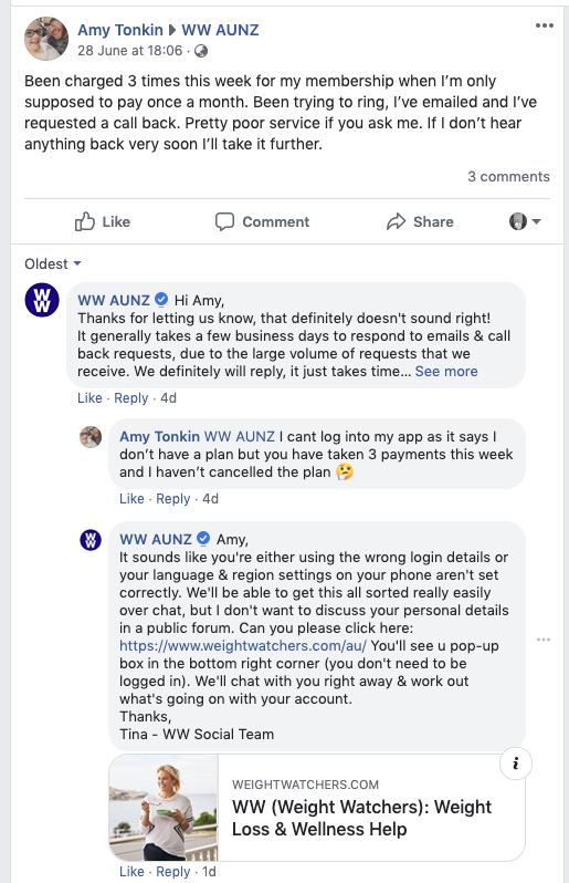
Obviously as with any subscription based company there are some customer service complaints about the process to cancel subscriptions, or people disputed being charged for months membership was agreed as part of the sign up deal. In general WW seem to manage this well politely pointing complainers towards the T&Cs and agreement they made at signup.
Ads
By the power of the Facebook advertising library, we are able to see all the ads WW Austalia and NZ are currently running.
WW are currently running two types of Facebook ads targeting:
- Membership sign ups
- Food sales
The membership sign up ads then split into two further groups.
Ambassador
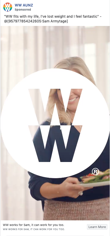
These are focussed around using the brand ad creative they have created using their newest ambassador Samantha Armitage. This is reasonably strong creative and given WW have decided to invest in Sam as an ambassador it makes sense to leverage her while they can, especially given the wider reach they are achieving through PR about her associate with WW.
It’s worth noting that here all the are video based.
Food options
Here WW lean on their recipe information and the option for members to eat a range of the foods that they would in normal life when on the programme, not just a restrictive diet.
The creative is well chosen and season appropriate, focussing mainly on warm winter food.

The only real issue I have to highlight here is that WW are again not featuring their every day members. I assume that the decision to not use before and after pictures/video has been a conscious decision in how they want to position the business, and also in what has worked best for WW in the past.
Food sales
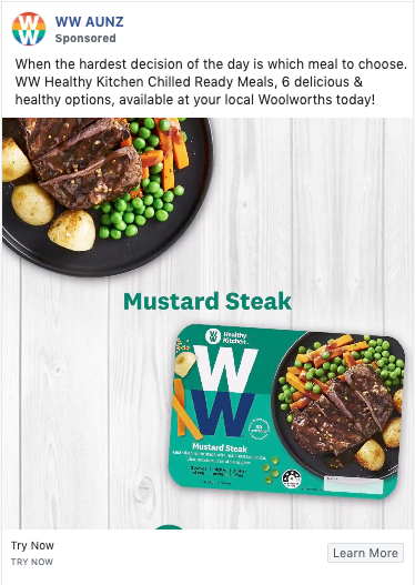
WW has a series of ads focussed around selling their ready meals. The ready meals are produced by Heinz, who owned the company from 1978 to 1999. Who’s purchase for $72 million (US) and sale for $735 million (US) doesn’t look like too bad a piece of business.
The ads themselves promote WWs new range of ready meals. The creative is quite catchy and the colours pop nicely making it attractive to watch. Interestingly rather than taking you off to the site where you can buy the product you are taken to a landing page on the WW site with more information about the range.
At the very bottom of the page there is a link to purchase the meals at Woolworths.com.au, the only retailer who sells the meals, they’re not even available on the WW site to buy in their shop. I assume this is to do with the licensing agreement with Heinz, but reviewing the packaging there is no reference to them.
Sponsored Page Posts
There is no evidence in the Facebook Ads library that WW are promoting any of their posts. It can be good to put a small amount of budget behind your regular posts to help kick start their engagement and ensure they appear in more of your followers news feeds.
Facebook Summary
WW have a reasonable range of post content. They are utilising user generated content reasonably well I static imagery, but are missing a trick when it comes to leveraging this more in video.
They’re running a range of ads to promote sign ups, and also their refreshed meal range. They’re doing what most brands do and leverage their high value assets to do, like Sam Armitage and with the information we have to hand we have to assume this, and not using more user generated content, before and after imagery, is based on previous lessons.
WW are essentially duplicating a lot of what they are doing on Facebook and Instagram, there is very little unique content.
As a brand this may seem like an easy way to manage Instagram, and that you will have different followers on the different platforms, so they won’t see the content twice. This isn’t strictly true, as Instagram really benefits from strong inspiring imagery in a greater way than Facebook does.
Unsurprisingly as most of the content is the same, WW are about as active on Instagram as they are on Facebook, posting once most days.
However what they are doing on Instagram is using stories quite effectively, or at least they were. Their stories are pretty engaging, but their latest one was 30 weeks ago.
Overall this is a bit of a pity, as despite a significantly lower following on Instagram compared to Facebook of 35.9k to 178k, they have better engagement with their posts. They are only averaging 0.74% engagement rate. This is okay, but with better imagery and more user generated content they could be pushing this higher.
Instagram Summary
There are some positives here with some reasonably good engagement levels, but a lack of attention and focus on what works best is limiting what they could achieve.
Jenny Craig Social Media
As with WW Jenny Craig have social account across multiple platforms, however unlike WW they are active across all the platforms they are on.
On Facebook the content which Jenny Craig posts can be broken down into:
- Recipes
- General tips/advice – which link back to blog posts on their site
What’s interesting here is they are not really using any user generated content, or pushing before/after shots of their members.
As with WW and most brands, Jenny Craig are using their logo as their profile photo.
Their cover photo is a before/after shot of one of their members. The story of this member is in the success stories section of their onsite blog, but they’ve missed an opportunity to provide a link to this in the image description. As with WW they are missing an opportunity here to have a video in place. However they are leveraging the before/after shots which I think WW are missing.
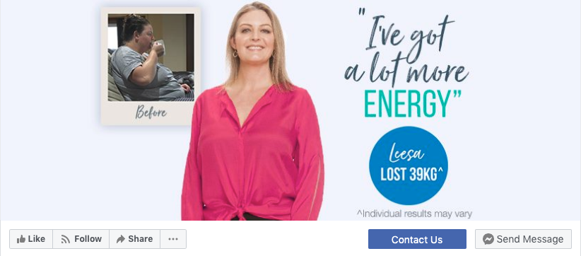
Interestingly they are not using the Sign Up feature here, instead having a Contact Us button which takes you to the request a call page on their website. This is providing essentially the same function, however to a visitor is providing duplication as next to the button is the Facebook Messenger Send Message button. I think a Sign Up button would be better here for this reason.
Jenny Craig are also not using the messenger page option which opens up the messenger chat box when you land on the page. This is a good way to divert queries into chat, but is harder to manager if you have a smaller customer service team.
Post Content
Jenny Craig’s posts break down into:
- Recipes
- Link Posts – back to their blog with helpful advice or tips articles
Really these two types of posts could be grouped together as they both take people back to their site and serve a similar function of providing useful information to Facebook users.
In general the posts have a limited amount of engagement, with most receiving less than 10 likes and no comments. The main value of these to Jenny Craig is probably getting traffic through to their website from Facebook, and getting these people to engage with them there.
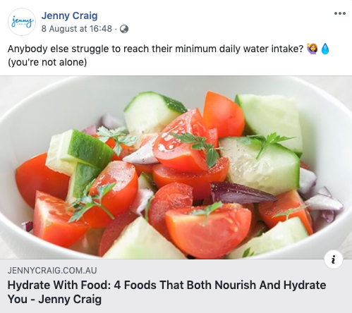
Jenny Craig are using the link preview function which Facebook developed, as well as UTM tags on their articles. This is good as it ensures that they can correctly track back traffic and see which content is working best for them on Facebook.
Video Content
While they do have some video content on Facebook, it is limited and they have only posted 6 videos this year. It’s no secret that video has better engagement on Facebook and many brands are using it as the main type of post that they do. Jenny Craig are really missing out on a significant opportunity here.
User Generated Content
There is almost no UGC on Jenny Craig’s Facebook page. Again this is a significant missed opportunity. There is also very little content highlighting before/after shots and the weight loss members have achieved. This content exists as its being used extensively on their website, so it is odd that it is not being used here.
Community Management
There is a fairly active engagement with Jenny Craig from their members and visitors to their Facebook page. Correctly Jenny Craig have been quick to respond to comments and engage with posters, however they are generally receiving only one post every few days, which are also generally positive.
Ads
Jenny Craig are currently running two types of Facebook ads targeting:
- Membership sign ups
- Recipe ebook downloads
The membership sign up ads can be further broken down into two groups, those which use an ambassador and those which use their members.
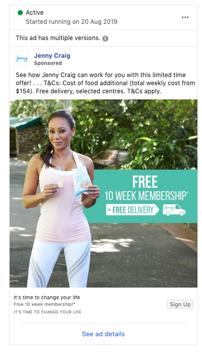
All the ambassador ads feature Mel B. This obviously ties in with their site and is a good use of their ambassador. However given they are not using Jelena Dokic here, it reinforces my opinion that they have found she doesn’t resonate with their target market. The Mel B ads are all using the same copy, and also reference the fact that Mel has been able to keep her weight off for 5 years. It would be a good opportunity here to test some different copy variants.
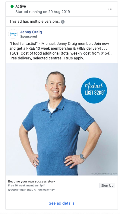
The member based ads use the same members they feature on their website. This is a good use of real people, and will help to create engagement with other potential customers. However the imagery of these ads is a little sterile I feel, and would maybe be better featuring the members in real word scenarios.
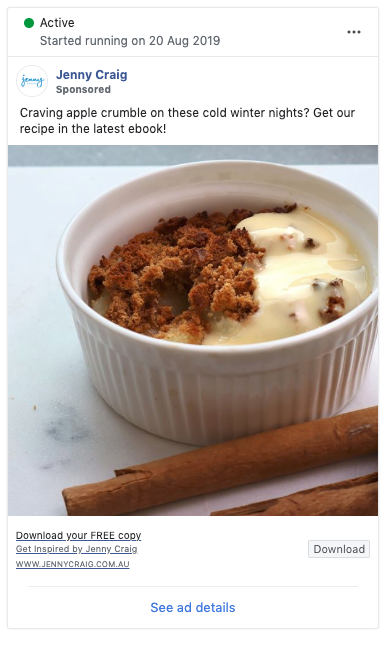
The ads for recipe ebook definitely do not come across as sterile, and are very enticing. If you click on one of these ads you are taken to a sign up form for the Inspired Magazine and email list. I think this is slightly disappointing for a user. The Inspire magazine issues include 2 or 3 recipes, where an ebook to me suggests that I am going to get a small digital recipe book.
Interestingly there are no ads with creative specifically for retargeting. I think there is an opportunity here to have ad copy and visuals which play directly to people who have visited the request a consultation form but not completed it.
Facebook Summary
Jenny Craig’s Facebook strategy seems a little unevolved and basic, especially in comparison to WW. There is a lot more they could be doing with their regular posts to include video, UGC and get better engagement. They are running a lot of ads but don’t appear to be boosting their posts to increase engagement, testing ad copy/imagery variants, or using video.
On Instagram Jenny Craig are not taking the easy route and just reposting the same content they are on Facebook. They have obviously acknowledged that users engage with slightly different content on Instagram and tailored what they do accordingly. There is some overlap, but the posts can be broadly broken down into:
- Recipes/food
- Tips/advice
- User generated content
Jenny Craig’s food posts get reasonably good engagement, comparative to Facebook. They don’t actually list a recipe here and obviously can’t link back to their blog due to the restrictions of Instagram. However this makes the focus be much more about the food imagery itself, and encourages them to just create a post which people respond to like this one below.
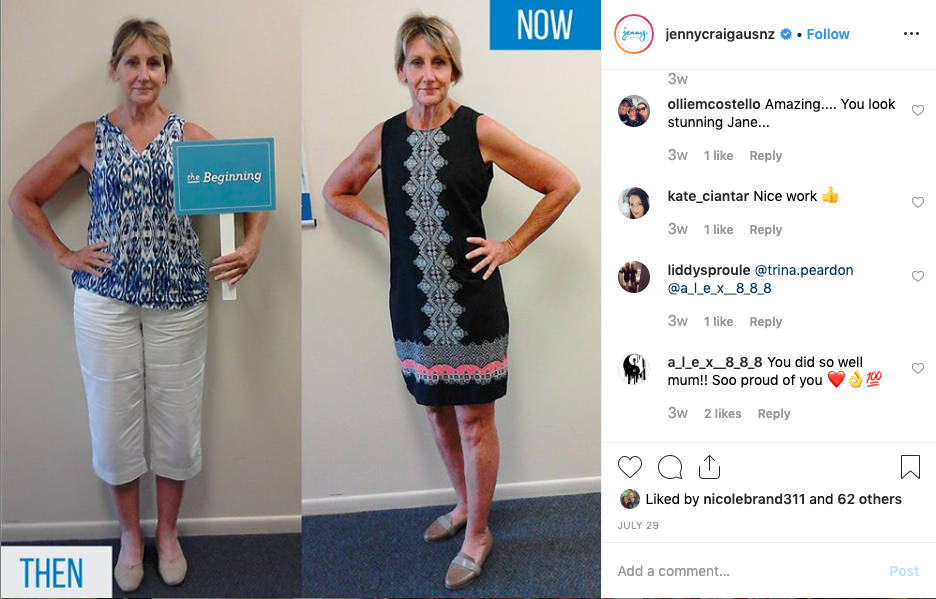
User generated content is so powerful for any brand in any industry. However with weight loss and fitness it has the power to create so much resonance as we have seen with WW. It’s therefor great to see Jenny Craig using UGC posts, and unsurprisingly these posts get the highest engagement.
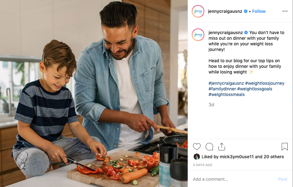
The tips and advice posts also get okay engagement. Jenny Craig are using these to try and drive traffic to their blog, however this is harder when there is no immediate link a user can tap on. I would suggest that they generally avoid trying to drive traffic by mentioning their blog and just focus on their overall message and creating resonance with their audience. In this example it would be focussing on still sharing dinner time with your family while dieting, and then trying to get some engagement by asking readers to say what is important to them about mealtimes with their family.
Instagram Summary
Overall Jenny Craig are doing a better job on Instagram than Facebook. They are incorporating UGC and this shows in the engagement they are getting in their posts. They are however not using video which would offer them so much more opportunity
YouTube
Unlike WW, Jenny Craig are fairly active on YouTube posting new content at least every week. Most of the content is either:
- User transformation stories & Ambassador videos
- Program details/information from dieticians
User transformation stories & Ambassador videos
Some of the videos are clearly recycled TV ads, but then there are often longer versions with the same client talking through their journey.
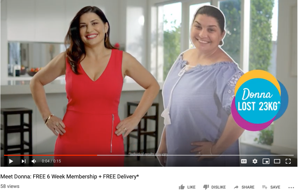
The videos are slickly done. They are great advertising material tackling the concerns people may have with signing up head on, and showing the results people have achieved.
At its heart, YouTube is an advertising and search platform. Which is why it’s just as important to optimise the titles and descriptions of videos on here, as it is done to it on pages on your website. It’s also important to tag your videos with the content matter, and categorise them, as this helps YouTube know what other videos it should be associated with. Jenny Craig are missing this detail out, which leads to generic information like the one below, which isn’t going to help getting their video to come up in general user search, or entice users to watch the video if they do see it.
Program Details/Information from Dieticians
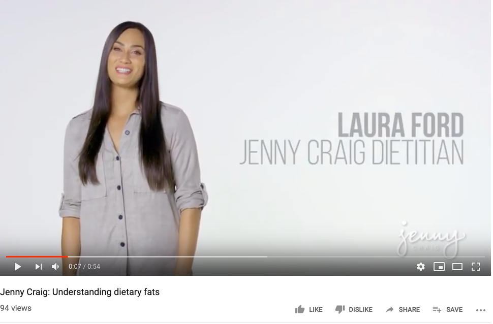
These videos are really great information. The dieticians are providing advice and education around key areas of interest for people who are looking to loose weight and stay healthy.
The videos are quick, informative and well done, however they suffer from the same issues around titles, descriptions, tags and categorisation that the others one do. They are also in general getting pretty low view rates. These videos are being used on the Jenny Craig website as well, but within a subcategory on the blog. There is so much opportunity to be using across Facebook and Instagram.
YouTube Summary
Jenny Craig are doing well in producing regular content, but are missing opportunities to optimise it better.
Social Conclusion
Jenny Craig are busy being active across three social channels; Facebook, Instagram and YouTube, and are doing well in not just replicating the same content across all three. In this they are really outperforming WW. However Jenny Craig could be dong a lot more to leverage user generated content and stories on Facebook. Both companies could also be doing more to use video across Instagram and Facebook.
From an advertising perspective WW seem to be more evolved here and are doing a good job integrating video.
WW Paid Search
Search Terms
To analyse WWs pay per click advertising performance I’ve relied heavily on SEMrush. I was able to download data on 303 keywords which they are targeting. This is however significantly down on last December and January when they were targeting over 1,000 keywords. This increase in keywords wasn’t repeated at the same time in 2017/18, but does suggest a switch in strategy around a key season for dieting.
Brand
Brand spend, defined as spend on search terms which includes WW or weight watchers, represents an estimated 1.5% of spend.
Competitor
However spend on competitor search terms, like You foodz and Lite n Easy is an estimated 33% of total paid search spend.
Weight loss Generics
The majority of Weight Watchers ad spend goes unsurprisingly towards weight loss related terms such as loose weight and weight loss meal plan.
18.69% of approximate spend goes on weight loss.
- Diet – 9%
- Diet plan – 3.7%
These are broad match phrases, not exact match, so include the phrases such as ‘the best diet plan’.
If anything what is surprising here is that Weight Watchers are not spending more on these terms, as you would assume they make up the majority of the relevant search terms for WW.
Ad messaging
Using the data from SEMrush I looked at what were the most used headlines, also referencing what type of headline each was.
These are WW’s most used headlines.
| Ad headlines | Frequency | Cumulative Frequency | Cumulative Frequency as a % | |||
| Brand | #1 Diet for Weight Loss | Easy to Follow Program | 9 | Brand | 64 | 21% | |
| CTA | #1 Diet for Weight Loss | Join Now | WW Australia® | 2 | Cta | 26 | 9% | |
| Brand | #1 Diet for Weight Loss | Lose Weight the Right Way | 11 | Offer | 209 | 69% | |
| Brand | #1 Diet for Weight Loss | WW Australia® | 29 | Food | 3 | 1% | |
| CTA | #1 Diet for Weight Loss | WW Australia® | Join Now | 4 | 302 | |||
| Brand | #1 Diet for Weight Loss | WW Australia® | More Freedom & Flexibility | 1 | ||||
| Brand | Choose Food You Want to Eat | #1 Diet for Weight Loss | 2 | ||||
| CTA | Join Now | #1 Diet for Weight Loss | WW Australia® | 1 | ||||
| Brand | Keep Eating the Food You Love | WW Australia® | 5 | ||||
| Brand | Stop the Fad Dieting | Voted #1 Plan for Weight Loss | 1 | ||||
| Brand | Voted #1 Best Diet | Stop the Fad Dieting | WW Australia® | 1 | ||||
| Brand | Voted #1 Best Diet | WW Australia® | Keep Eating the Food You Love | 1 | ||||
| CTA | Voted #1 Plan for Weight Loss | WW Australia® | Join Now | 10 | ||||
| CTA | WW Australia® | #1 Diet for Weight Loss | Join Now | 1 | ||||
| Offer | WW Australia® | 40% Off 3 & 6 Months* | 4 | ||||
| Offer | WW Australia® | First Month Free* | 112 | ||||
| Offer | WW Australia® | Get 40% Off 3 & 6 Months* | 1 | ||||
| Offer | WW Australia® | Get Your First Month Free* | 10 | ||||
| Brand | WW Australia® | Healthy Ready Made Meals | Meals That Fit Your Life | 1 | ||||
| Offer | WW Australia® | Join For Free* | 82 | ||||
| Brand | WW Australia® | Lose Weight the Right Way | #1 Diet for Weight Loss | 2 | ||||
| Food | WW Australia® | Nutritious Ready Made Meals | 2 | ||||
| Food | WW Australia® | Voted #1 Best Diet | #1 Diet for Weight Loss | 1 | ||||
| Brand | WW Australia® | Weight Loss Made Simple | #1 Diet for Weight Loss | 1 | ||||
| CTA | WW Australia® | Weight Loss Made Simple | Join Now | 8 | ||||
| (blank) | ||||||
| Grand Total | 302 |
The ad copy below shows how the headlines are highlighted in search.
Based on the breakdown of the titles we can see that WW are focussing on offers. We might assume that they are using offers with the broader generic keywords, when the user hasn’t searched a brand name. But this isn’t the case. Offer focussed ads are often used by WW with broad match targeting, so terms such as weight watchers calorie counter or weight watchers yogurt can result in ads like the one below coming up.
While it could be argued that the ad above has some relevance to those search terms, for instance someone searching weight watcher calorie counter may not be a member of WW yet (although equally they may be), the ad below comes up for the search terms weight watchers core diet, find weight watchers, weight watchers breastfeeding.
Again this ad copy may be relevant for weight watchers core diet, but find weight watchers and weight watchers breastfeeding would be much better served by ads tailored towards the users search intent:
- Multiple weight watcher locations
- Weight watchers, dieting and post-natal weight loss
There is an opportunity here for WW to be much more tailored with their ad groups and copy.
Calls to action
WW have a relatively slim selection of CTAs which they use, in fact just one join now. CTA orientated ads in fact just make up 9% of the total number of ads which they are running. I think it is interesting that they don’t combine CTAs with more of their offer orientated ad copy. There is just one headline which it could be argued joins the two together.
As I’ve previously mentioned there is an opportunity for WW to tailor their ad copy more to the searchers query. WW in fact only have 26 ad titles across 303 ads, their ads also only point to three different landing pages:
- Engagement Custom Audiences from video views
- https://www.weightwatchers.com.au/Join/Now
- https://www.weightwatchers.com/Offer/Limited-Time
Given the varied searches they are targeting, and the different types of situations a user may be in when looking at weight loss. There seems to be an obviously opportunity to also tailor these further. Their current ads are fairly generic, so may be getting a good ad score as they pair with their also fairly generic landing pages. But a lot more could be done here to improve click through rates.
Landing Pages
WW are essentially using their home page as their landing page for most of their paid search ads. There are obviously a lot of opportunities to tailor this, and they are missing the intricacies that a truly adept businesses implements. Their home page is a solid landing page, but as with their ad copy, is not going to be relevant for every search. If for instance, I searched weight watcher calorie counter, and then was taken to the home page I would probably bounce straight back to Google and go to the next link.
WW are actually targeting keywords around Keto diets, and have a page written about how a keto diet didn’t work one of their members who then lost weight on WW https://www.weightwatchers.com/au/success-story/natasha-tried-keto, but they are still taking potential customers from those search terms to their home page.
Some searchers will be taking place early on in the conversion funnel, when a potential customer is just starting to think about dieting, or general health and is just looking to learn more about why they should do this. A page tailored to their needs could be a softer sell as to why it would be beneficial for them and how WW could help them on this journey.
Paid Search Summary
There is a large opportunity for WW to improve what they are doing in search by providing more tailored ad copy and landing pages.
Given that during December and January 2018/19 they increased their keyword count up to over 1,000 keywords, there are obviously a broader range of search terms they could target. Perhaps they scaled back in February as this was a seasonal campaign, but that they have gradually cut back on their keywords since then down to the current 300 suggests that they are culling search terms and ads which aren’t working for them. If they were targeting generic ads to these search terms, and pointing them to their landing page then this isn’t really any surprise. They are probably only finding the best keywords are providing a positive ROI for them, you have to think that they could achieve so more with a more thought through search campaign.
Jenny Craig Paid Search
Jenny Craig currently has a very limited paid search strategy. In August 2019 they are only buying 49 keywords, for an estimated cost of $3,000. As recently as December and January they were targeting over 800 keywords and spending an estimated $23,000. The graph below shows how the range of keywords they have targeted has fluctuated over the last two years.

Keywords
Interestingly at this point Jenny Craig is only targeting generic keywords. They are neither bidding on their own brand terms, and only to a limited extent on competitor terms.

There is a reasonably logical argument that you should only bid on your own brand name if competitors are doing it, as you are getting traffic which you would already be getting via organic – particularly if you own the first page few organic results. Likewise bidding on competitor search terms can be expensive as you will have a low as relevancy score. high/medium imapcts on the site of the vehicle.
If Jenny Craig have a limited budget, as it appears, these two restrictions make sense.
Competitor terms
The only competitor term Jenny Craig bid on in August was five point four. This was an alternative pre-prepared meal company who went into administration earlier this year. It looks as though this was opportune bidding to try and get some of their customers once they had closed, rather than actually targeting a competitor.
Most of Jenny Craig’s limited spend unsurprisingly targets the search terms weight loss and meal delivery.
- Weight loss – 73%
- Meals – 75%
These are broad match phrases, not exact match, so include the phrases such as weight loss meal delivery.
Ad messaging
As Jenny Craig as only targeting a small number of keywords, they have very limited ad messaging running. They have only 5 different headlines they are running, all of which are offer based.
| Title | COUNTA of Title |
| Jenny Craig Weight Loss Plans | $8 Membership for 8 Weeks* | 1 |
| Jenny Craig Weight Loss Plans | Free 10 Week Membership | 1 |
| Weight Loss Delivered Meals | $8 Membership for 8 Weeks* | 17 |
| Weight Loss Delivered Meals | Free 10 Week Membership | 7 |
| Weight Loss Delivered Meals | There’s No Time Like Now | 23 |
| Grand Total | 49 |
The ad copy below shows how the headlines are highlighted in search.
Based on the ad copy we can see that Jenny Craig are focussing an offer, combined with either weight loss plan or weight loss delivered meals. Unlike some of the WW ads, the ad copy is very focussed to the search terms they are targeting. They are not targeting any search terms like BMI calculator, which might show that the searcher is earlier in the decision making funnel and not yet ready to join Jenny Craig. They are targeting keywords such as ready made diet food which suggests the users is closer to a buying decision. There is in fact only one awareness stage keyword they are bidding on best diet to loose weight after pregnancy. As with WW there is an opportunity here to target the ad copy better to the keywords they are bidding on. There is no ad copy that references pregnancy.
Calls To Action
Jenny Craig are not really leveraging CTAs in their ad headlines, they only have one ad which has something like a CTA – There’s no time like now, although this is more of a statement. There is obvious potential to drive more of a response with copy like Sign up today. However it is possible that Jenny Craig have already tested this and it hasn’t worked for them, although there isn’t any evidence that they are A/B testing different ad copy in the data we can see in SEMrush.
Landing Pages
All the Jenny Craig paid search ads go to the home page. As with WW this seems like a missed opportunity. An ad which targets pregnancy keywords could point to the pregnancy lifestyle section within their blog. Given the categories they have here on the site around varies times you may want to diet, such as pregnancy, menopause and weddings. There is a lot of room to easily have targeted ad copy which drives awareness of Jenny Craig early on in the decision making funnel.
Paid Search Summary
Jenny Craig really only have a very basic paid search campaign currently running, which probably reflects a limited budget, and potentially only limited past success. There is plenty of room for them to improve the performance of the current campaign through ad copy and landing page improvements which could reward a higher investment.
Paid Search Conclusion
WW and Jenny Craig are spending radically different amounts on search. However they both have the same problems with ad copy and landing pages. Improvements in these areas should see a great ROI for both businesses.
WW Content marketing
The cornerstone of good content, is a story. With so many members, with so many emotional and impressive weight loss journeys, there is a rich stream of content for WW to leverage.
Onsite
WW have a fairly clear onsite content strategy. They mainly produce content around these areas:
- Recipes
- Member stories
- Tools
- Wellness
Within the public WW website there are a deceptively large number of food recipes, and this makes sense. The core of what WW do is to help their members loose weight, or maintain a healthy weight. A healthy diet, and good recipes to cook healthy meals from, are a fundamental aspect of both of these. Especially given some members will be learning to cook in a different way.
The recipes section of the WW website does rank well, they have a number of recipes showing in the top 10 in Google with high search volumes. These will be bringing in significant traffic volume to their site. However I question how much of this traffic will stay on the site. If you aren’t specifically looking to loose weight does the fact the recipe is from WW put you off?
Once on the site however the recipe section is let down by its lack of search function. The recipe section of the site is reachable from the top nav, and it is broken down nicely by themes with seasonal recipes brought to the front. However there is no search function, I can only navigate by the categories provided, rather than search exactly for what I want. This is a significant shortfall. Users are forced to go back to Google if they don’t land on what they are looking for, or decide to look at some different options once they get to the site.
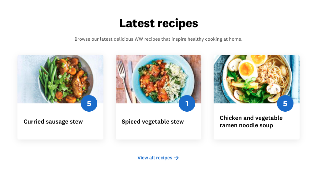
Once I am on a recipe page, there are related recipes however these seem a little random. My recipe of pumpkin, ricotta and spinach toastie has these six related recipes
- 90 second mug muffin breakfast
- Pumpkin soup
- Zero vegie soup
- Healthy zucchini slice
- Sarah’s banana loaf
- Sarah Van Dyke’s apple crumble muffins
Other than the pumpkin soup I don’t see much of a relationship here. I would expect to see recipes for items with the same or similar ingredients, or recipe’s for other toasties.
Once you are logged into the members area the recipes are harder to locate. If you go to the Program area from the top navigation, you can then go to the food ‘category’, but this doesn’t actually have any recipes. You need to use the app to actually access the members only recipes, and once here the experience is pretty good. There is good categorisation and a search option! No related recipes on the recipe pages though. There is obviously limited space on a phone screen, but I think these could have been included in horizontal slider at the very bottom without impacting negatively on the user experience.
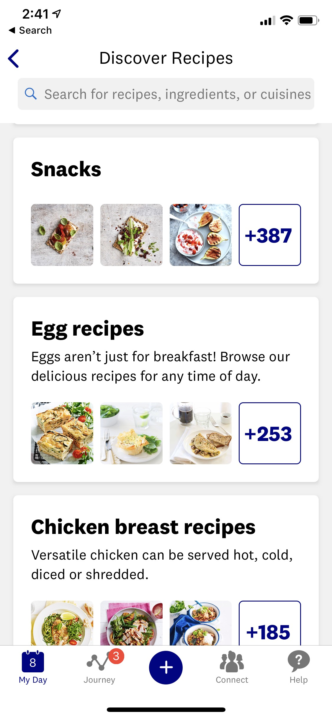
Member Stories
Dramatic before and after shots are a powerful advertisement for many products, and nowhere is this truer than when it comes to weight loss. The importance we place on how we look, and the emotional importance of food and eating for many of us, means these have an incredible sense of drama and appeal.
WW however tend to shy away from the drama of a before and after photo in their content. They do feature Member Stories, which can be found on the site when not logged in by navigating to the Healthy Living section. Here WW tend to pick up a nice thread of a story of a member who has lost a significant amount of weight and turn it into a story. They are very advertorial however, and don’t feel that natural – although they are well written and accompanied by some well taken photography of the subject living their new improved lifestyle.
The category page is not ranking particularly well except for very specific weight watchers related search terms.
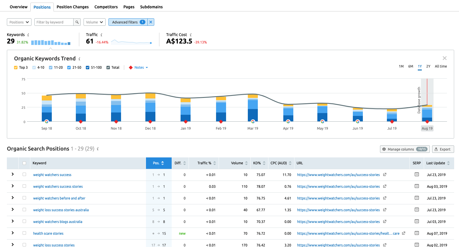
The story detail pages are ranking better (oddly these have a different url success-story compared to success-stories to the category page, so we can’t review them at the same time in SEMRush), and are ranking well for the names of some of the ambassadors.
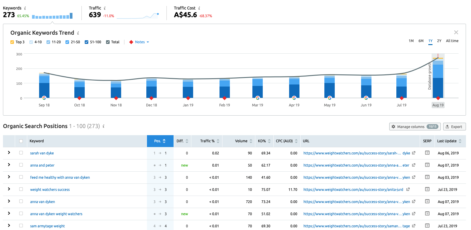
These pages are as a whole not doing a huge amount for WW in search. One success story is linked to from the very bottom of the sign up page, so is being used to help convert potential members who are the fence. I would suggest it would work better to have this included further up the page near the buttons to continue with the sign up process.
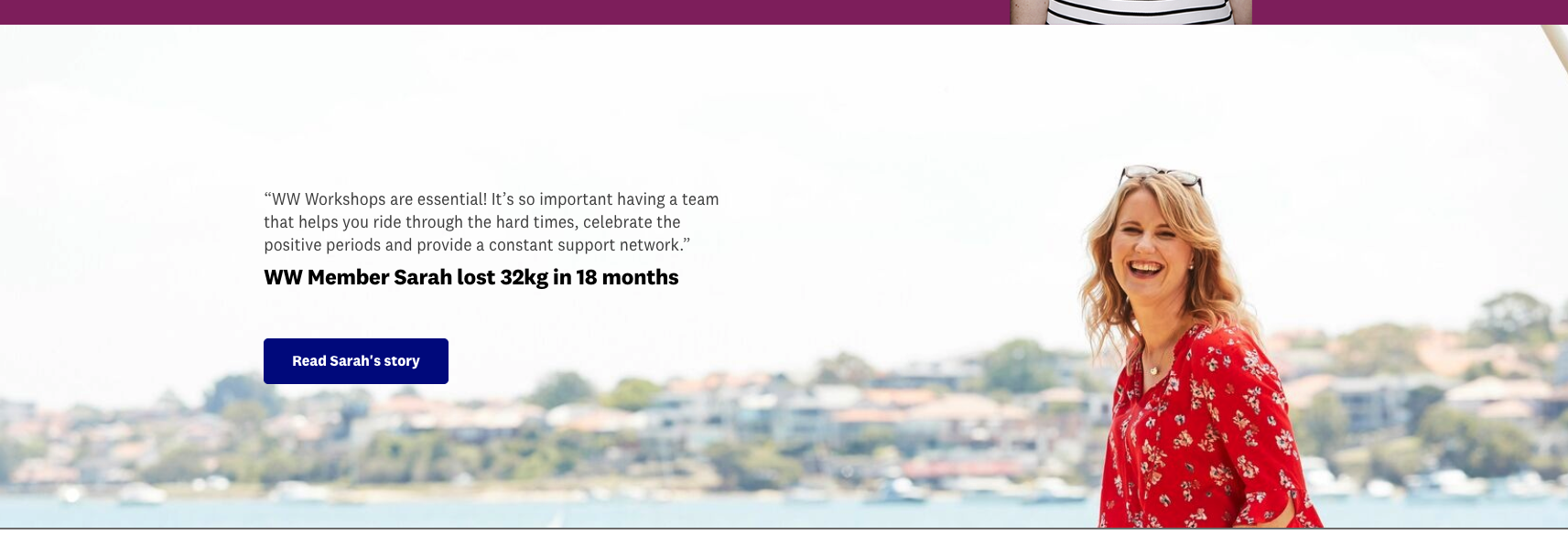
WW are doing some promotion of the user stories through social. Using a members before/after photo they will post a quote from the member along with a link to the members story on the website. This is a relatively recent trend, as they have only been doing this since May. The likes across the posts also varies significantly so it looks like they have been trialling boosting some of the posts. Given the strength of these images, this makes sense as it significantly extends their reach.
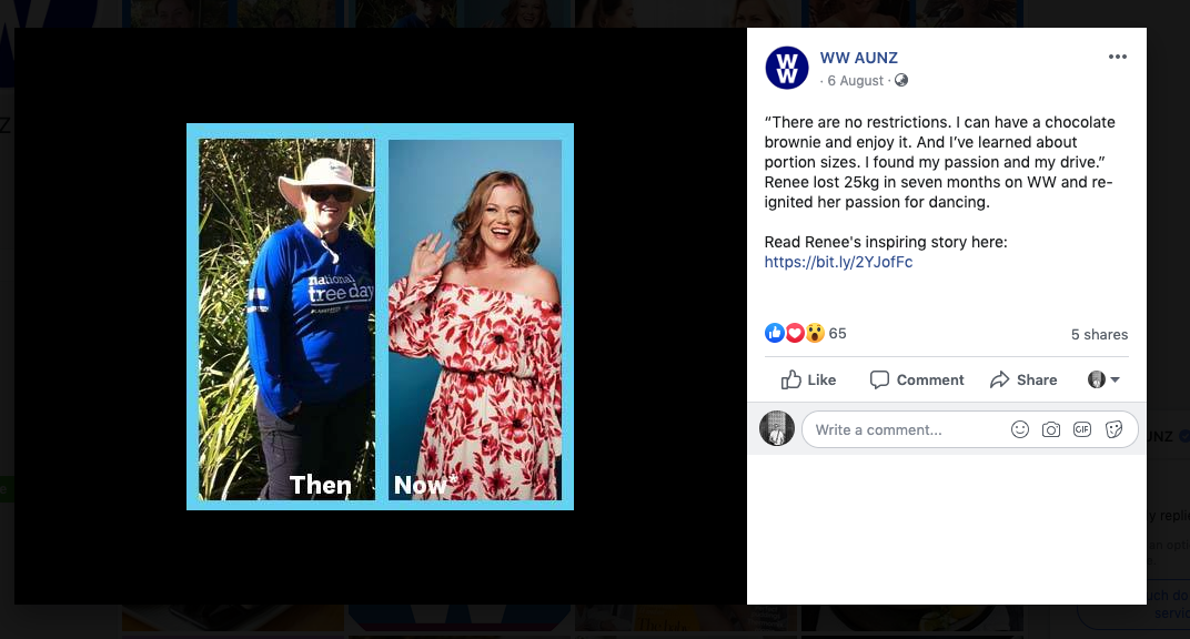
Once you are a member of WW and logged in either on the app or on the website there is a wealth of User Generated Content and inspiring stores from members. The Connect social functionality is essentially a never ending list of people posting before/after photos, talking about how much better their life is, or posting about how this is the start of their journey and getting support from other members.
WW have obviously taken a deliberate decision not to use this content in their marketing. It’s hard to know exactly why, as it would surely have a lot of resonance with their target market. Perhaps they are trying to distinguish themselves from other health/diet companies who do do this? There has been some use in social, and some boosted posts, but it seems like WW are missing a significant opportunity here.
Tools
WW have one significant tool on their site, their BMI calculator. This tool has high rankings in organic search for some search terms with decent traffic (no.2 for bmi calculator women with 14,800 monthly searches). SemRush predicts that WW are receiving 10,300 monthly visits to this page from organic search. This is a great result and obviously ties well into WW’s target market, people who are looking to loose weight to have a healthy lifestyle. Understanding if your Body Mass Index is high is a useful indicator on if you are overweight.
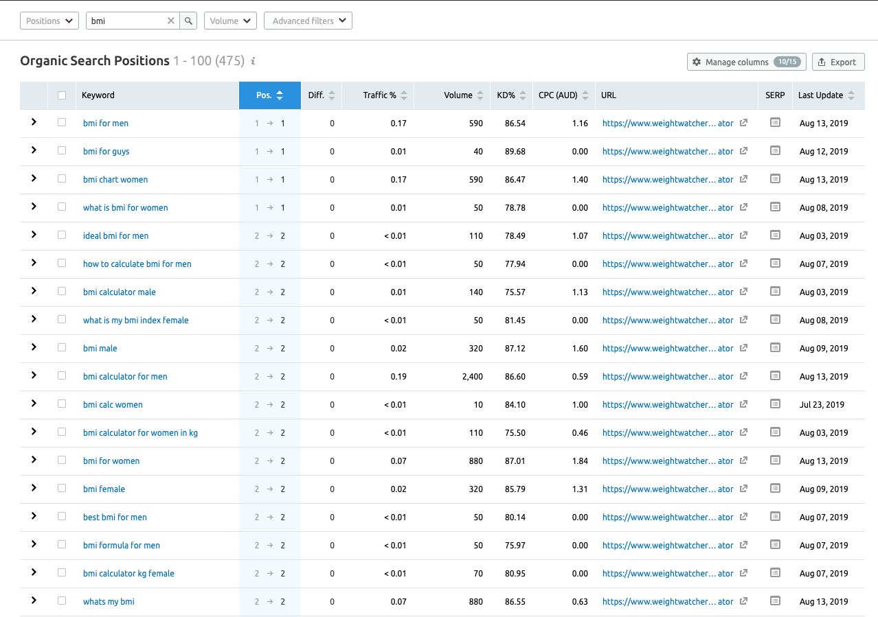
There is a decent amount of information on this page beyond the BMI calculator, with content around both why checking your BMI is useful and also why it may not accurately predict if you are healthy or not. At the end of this there is some information on loosing weight with WW and some cross links into other WW content.
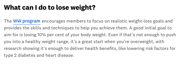
Overall this is a good content page and is clearly doing a great job of acquiring non-brand traffic for WW.
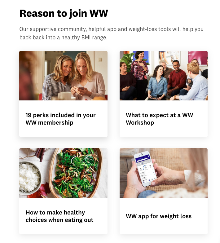
Jenny Craig Content
Jenny Craig are writing producing good quality content around several subject areas:
- Recipes
- Member success stories
- Weight loss at different lifestyle stages
- Exercise
- Tools
Recipes
While there may not be as may recipes on Jenny Craig as WW’s public site, there are still over 100. As with WW this makes sense on one level, as healthy eating and good food ideas going hand in hand with weight loss. However there is something of a conflict here as a Jenny Craig client you must buy their food, at least for the first few months. So this range of recipes aren’t really relevant for their new clients, only those later on in the diet or who are trying to maintain their current weight.
As with WW, this area suffers from not having a dedicated search function, although there is a general one on the site which will also find recipes for you. Once on a recipe page there are also related recipes, but again as with WW there is no real link between the recipe I am on and the ones which are suggested. However the recipe section does have nice categorisation, and overall it’s really quite visually appealing and nice to navigate.
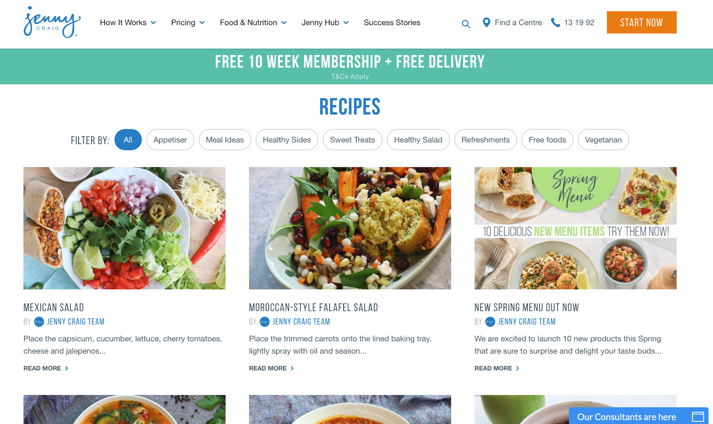
Overall the recipe section only has a few top 10 rankings in Google, 8 in total if you exclude branded search terms. It is only driving 750 or so visits a month, this has however been increasing quickly over the last few months.
Success Stories
As with WW Jenny Craig has a large number of success stories on their site. As I’ve mentioned before there is something hugely emotive of a dramatic before and after photo, and Jenny Craig does this better than WW. As soon as you go to the success stories area, which is easily found from the top navigation, not tucked away like on WW’s site, you are met with a wall of before and afters.
As you would expect the stories do a good job of showing the Jenny Craig experience in a positive light, they show the emotions the subjects were feeling when they started with Jenny Craig, which will help create resonance with readers in similar positions. Some of the stories are also accompanied by some well shot videos with the subjects.
As with WW the section is not driving a huge amount of organic traffic, although this has almost tripled over the last 5 months.
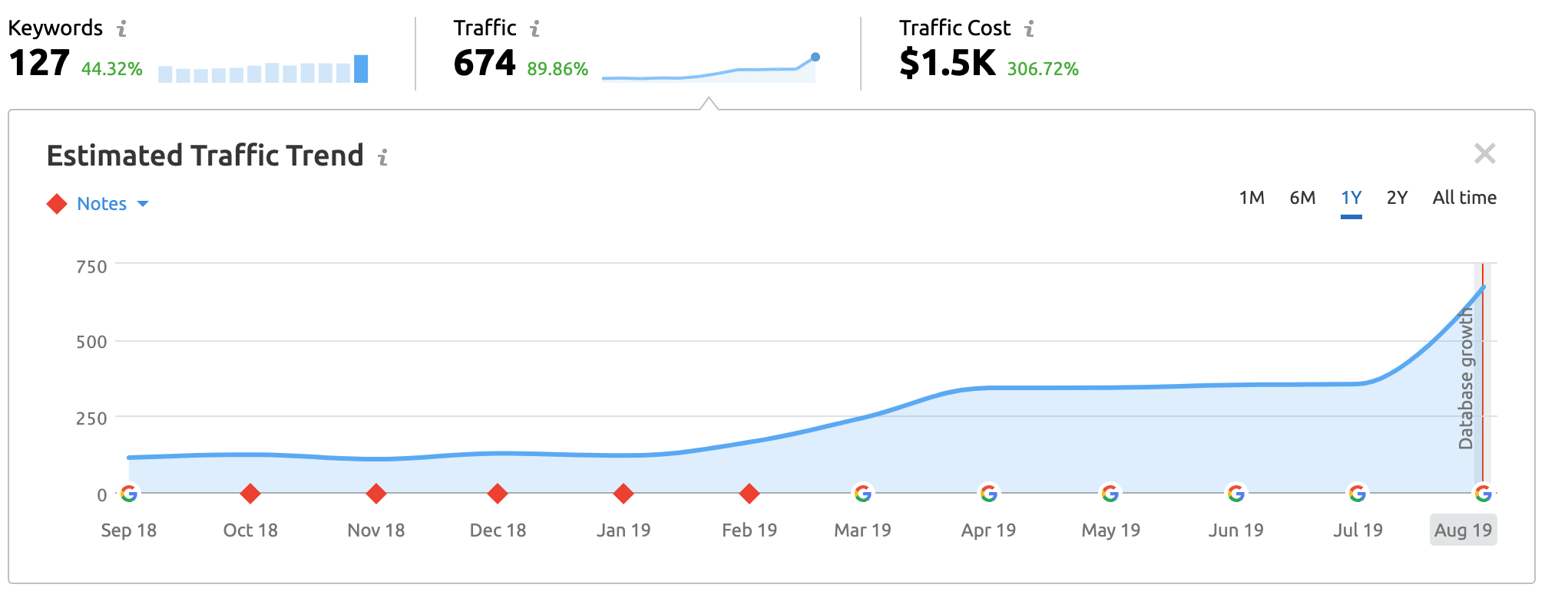
Weight loss at Lifestage, lifestyle and wellness
These are two great sections which tackle a range of subject areas which potential clients may be searching.
The Lifestage section is broken down into:
- Pregnancy
- Menopause
- Mum
- Wedding
While lifestyle and wellness is broken up into
- Exercise
- Health
- Diabetes
- Hints and Tips
- Eating out
- For Men
- For Women
Both of these sections look reasonably new, with SEMrush only recording traffic to the category URLs in 2019. However this may have been to a new site launch or restructure which saw the URL change.
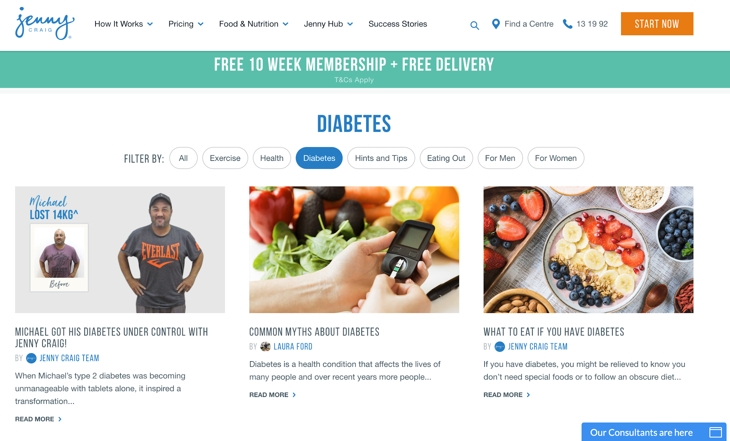
While neither of these sections are driving a large amount of organic traffic, they have huge potential in providing relevant information for potential clients who are on the site. They can also be used in social, which Jenny Craig are doing to a limited extent on Facebook. By answering questions and talking to subjects which are being researched, there is the possibility of getting some of these pages ranking well and driving reasonable levels of traffic around generic keywords such as weight loss exercise. They also remain of useful value to existing clients as well as potential clients

Again SEMrush is showing a significant uplift in traffic to the Wellness and Lifestyle section of the last month. This is obviously a positive sign for Jenny Craig and suggests that their strategy around content creation for these subject areas is paying off.
The articles in these areas are made of genuinely useful information. However some of them lack depth. For instance What to eat if you have diabetes really only has 3 short paragraphs of content. I think they could have fleshed this out substantially and made it much more useful and rank better.
Tools
As with WW, Jenny Craig has one major tool on their site, their BMI calculator. However this really lacks the depth of data which the WW has on their page, and this is reflected in its performance in search. Traffic to the page has actually dropped off significantly over the last 12 months.
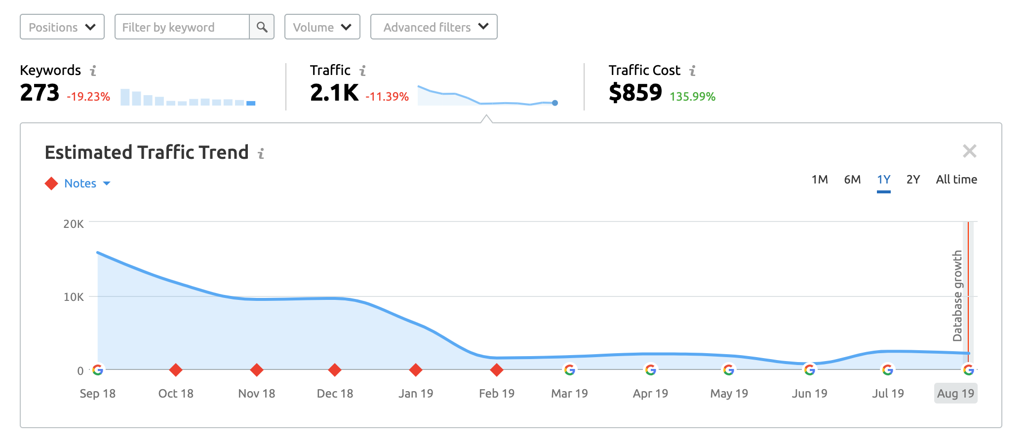
They currently only have two rankings for the page in the top 10. But given how many rankings they have in the top 20, it should be relatively straight forward for Jenny Craig to add more content to this page and push some of these into the top 10. This is a huge opportunity for them given the large volume of traffic which goes to some of these BMI search terms.
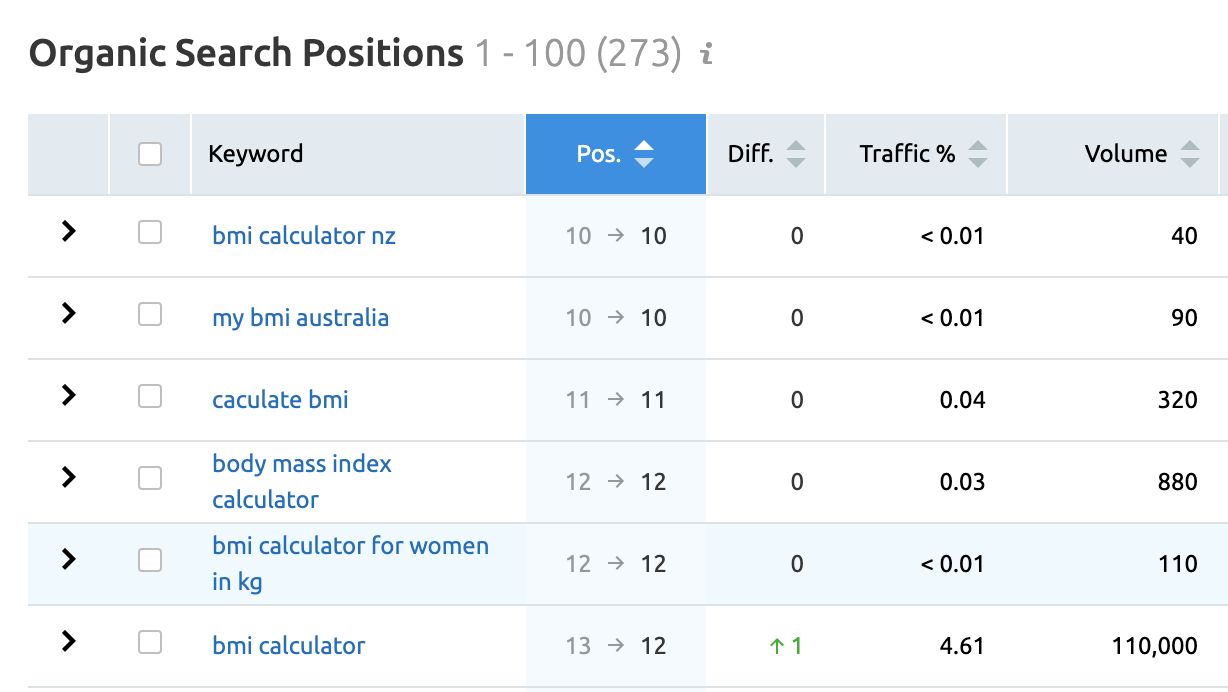
When you are actually on the site the calculator is hard to find, only being linked to from the link well at the bottom of all pages.
Content Conclusion
There is a lot of opportunity for both WW and Jenny Craig to do more with the content they have on their site, and with developing more targeting content.
Jenny Craig are leveraging their success stories better than WW, but are not paying attention to their BMI calculator page and are loosing traffic as a resulOverall Jenny Craig look to have the more evolved content strategy, with what looks like new content areas around lifestyle and wellness. These two areas have a huge opportunity to drive relevant, engaged traffic to their website and they are staying to see some traffic increases to these areas. In my opinion this information is much more relevant and will get them better traffic than their recipe section.
Overall Conclusion
When looking at their marketing programmes as a whole it definitely appears that WW have (unsurprisingly) a bigger budget and their use of channels is often broader because of this. However it does not mean that WW are out performing Jenny Craig in all areas. Jenny Craig are clearly more astute in their use of public social media platforms, although there remains room for them to improve further.
There is always room for improvement in a businesses marketing. What is perhaps slightly surprising when we look at these two international businesses is how much room there is for both of them to lift their game. This is most obvious in their use of paid search, with areas both companies could quickly improve to give them a better ROI.
In comparing the two businesses, WW definitely have the edge. However given their significantly larger size and presumably budgets, their marketing is not that much more sophisticated than Jenny Craigs.
To recap some of the main takeaway from this article;
- Both brands have proven products which approach the market slightly differently
- Their websites look good but WWs could do with improvement in navigation and content hierarchy
- Emails from both businesses are automatic, take you on a journey and contain good content, but could be better personalised and do need work
- Both brands provide useful onsite content, which is designed to acquire organic traffic and raise awareness. There is room for both companies to leverage this better and create more content.
- WW are doing extremely well in organic search, while Jenny Craig look like they have been suffering over the last few months with traffic decreases.
- Social media is designed to engage by both brands, but there are significant areas both could improve
- WW are generally ignoring the use of user generated before/after imagery which prevents them from engaging with existing and potential members
- WW have built a substantial private social network with large numbers of active members. This will be helping create greater engagement with their platform and is likely helping get their members better results.
- Paid search is an area of weakness for both brands and could be significantly improved
Weight loss, fitness, and wellbeing are business segments that have become increasingly valuable, and increasingly cluttered over the last few years with a significant number of new entrants into the market. With established brands, both WW and Jenny Craig are in a strong place to maintain their position. However, it appears that WW has been doing the most to adapt to the changes in the market and consumer demands, significantly evolving its product offering and platform.
