These days turning a curious click into a dedicated customer requires more than just a sleek design and catchy copy.
It’s about curating a unique, personalised experience for each visitor, and ensuring they’re engaged from the first interaction. From reinventing your conversion funnel to the power of personalisation, here are six innovative funnel optimisation ideas that can supercharge your conversion optimisation strategy:
Idea #1: Flip Around Your Funnel
Conversion optimisation is much like dating. The more people get to know you, the easier it is to make a commitment.
Your funnel is the same way. You have to remember that it doesn’t have to look like all other funnels that you’ve seen from other companies. If you can engage with your website visitors and get people to your most important content, you’re on a good path.
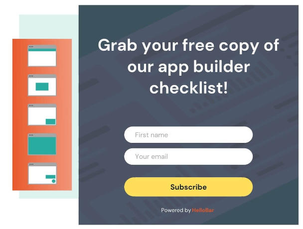
Tools like Hellobar can help you better understand your audience and what it reacts to. The tool allows you to customise what you want users to see and when you want them to see it. You can create a goal so the tool can help you get to where you’re going.

Idea #2: Evoke Curiosity
You have to give people a reason to stick around, and one way to do this is to create tests and offer data-driven information right away.
For example, if someone can quickly type in their domain and you can quickly tell them how many issues their website has, they’ll be hooked and want to know more. The immediate output not only provides value but also makes users curious about how they can resolve these issues or improve further.
When people have a little bit of data in front of them, it evokes curiosity. As an idea, build free tools to engage your audience and tract links!
Here are a few ways to evoke curiosity:
- Teasers and previews: Instead of giving everything away upfront, provide snippets or previews of your content. This will entice users to dive deeper. For example, if you are selling a book, give away a free chapter!
- Open-ended questions: Ask engaging questions that resonate with your target audience’s pain points. Questions evoke a natural instinct to search for answers, so you will see more people engage with your page in search of answers.
- Mystery offers: The uncertainty of what they might receive can be more enticing than a straightforward offer.
- Interactive content: Incorporate interactive elements like sliders, hover effects, or collapsible sections that reveal more information upon interaction, making users actively engage with your pages.
Idea #3: Don’t Forget to Follow Up
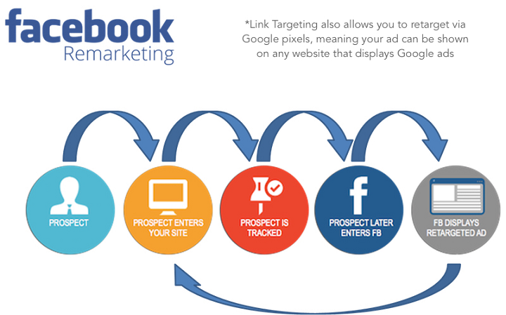
Remarketing is a great way to keep your product in front of people’s eyes. For example, if someone visits your site and checks a certain product page, you can use retargeting campaigns to remind them of your product when they are outside of your site.
Both Google ads and Facebook offer powerful remarketing options allowing you to reach your site visitors on both those platforms as well as on their publishers’ sites.

Image source: Linkedin
Idea #4: Quiz Your Visitors
Once someone is taking the time to fill in responses, you’ve gotten micro commitments from them and you’re training them (going back to idea #3 above). Three tips on creating quizzes include:
- Start with 5 questions.
- Use images when possible.
- Limit your choices per question to four.
If you start doing more than 4 questions you’ll notice a huge drop-off of people taking your quizzes. Interactive quizzes were also a big part of his testing, so that’s something to try if you have the resources. Overloading your audience with options can lead to decision fatigue and increase drop-off rates.
You can also use quiz results to segment your audience for tailored follow-ups. For example, if someone shows interest in a particular product or service through their answers, you can nurture them with relevant content, email follow-ups and ads.
Idea #5: Make Signing Up Easy
Most people have probably signed up for 200 things in their lifetime. Do they want to keep giving out their email and password? Doubtful. Buffer did something interesting with their signup section where all you had to do was click a button and log in with Twitter, Facebook, etc. Today, more and more companies are making this their strategy for easy signups.
Sure the person has to click authorise on the next screen, but it’s not really a sign-up. If you do that you’ll find out you get way more signups because it’s easy (and let’s face it, people are lazy).
Idea #6: Get Personal
Plain and simple, people want to feel special and they are more likely to pay you if you make them feel that way.
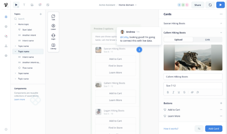
Tools like Voiceflow allow you to create personalised user journeys throughout your site. It has a handy interface allowing you to create workflows leading your site visitors down the sales funnels that suit their needs best.
Personalise your site’s buying journeys using AI-powered chatbots.

Three Main Takeaways
- You have to know how to think about conversion optimisation the right way. This will help you get more wins.
- You have to know how to come up with tests successfully so that people are actually clicking on the test and giving you that data.
- Make sure to try some of the suggestions on tests that you can run that should help boost your conversion rates.
As the social media marketing world and digital marketing industry continues to evolve, the art of converting visitors into buyers is no longer just about SEO services and mere tactics but a holistic approach prioritising genuine engagement and personalisation.
By flipping your funnel, evoking curiosity, consistently following up, and tapping into interactive content like quizzes, you can foster deeper connections with your audience.
Remember, it’s not just about getting a click – it’s about nurturing that click into a loyal customer journey.
If you want to chat with someone about how to turn clicks into customers, our social media experts Brisbane can help you build your business and convert your customers!

