Overview
What do effective lead gen forms look like? It’s an important question. The design of your lead generation form can have a huge effect on your conversion rates – even the smallest details can make a big difference.
In this article, we’re going to be looking at look at lead forms from a design perspective and sharing 10 expert tips that will help you to nail your lead capture form designs.
1. Keep the important information above the fold
Humans are lazy; we don’t like to scroll. There’s plenty of evidence that proves this. For example, a study from Nielsen Group found that elements that appear above the fold (those that are visible without having to scroll) were viewed 102% more than elements below the fold.

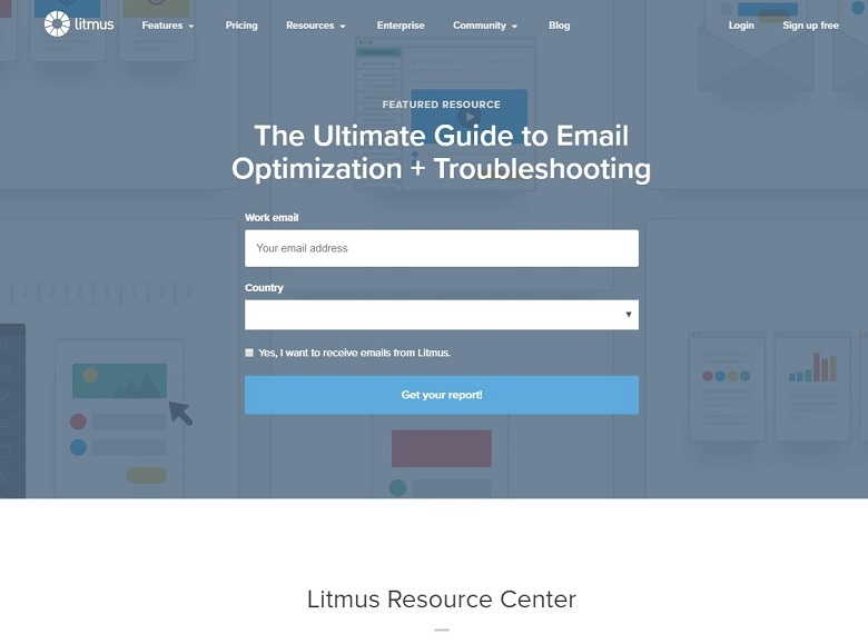
This makes it essential that, if your lead gen form has its own landing page, all the important information appears above the page fold. A powerful headline, bite-size information, form fields, and your CTA should all be immediately visible, regardless of what device your visitors are viewing the screen on.
2. Use high-contrast colors for your CTA
One of the biggest discussions surrounding lead generation form design is related to CTA button colors. There have been tons of studies trying to figure out what the most high-converting CTA button color is.
One of the most famous of these studies comes from HubSpot. They ran a split test to compare how well green and red buttons converted and found that the red button generated 21% more conversions.

They drew the conclusion from this that red converts better than green. But guess what? They were wrong.
The truth is, there is no single color that converts better than any other color. Rather, it’s all about how well your CTAs stand out on your page.
In the case of this Hubspot study, the red button jumped out at viewers more because it was the only red element on the screen. If you look closely, you’ll notice that green features in both the company logo and in several other design elements on the page.
When you’re designing your own lead capture form, choose a high-contrasting color for your CTA that stands out against the rest of the page.
3. Keep form fields to a minimum
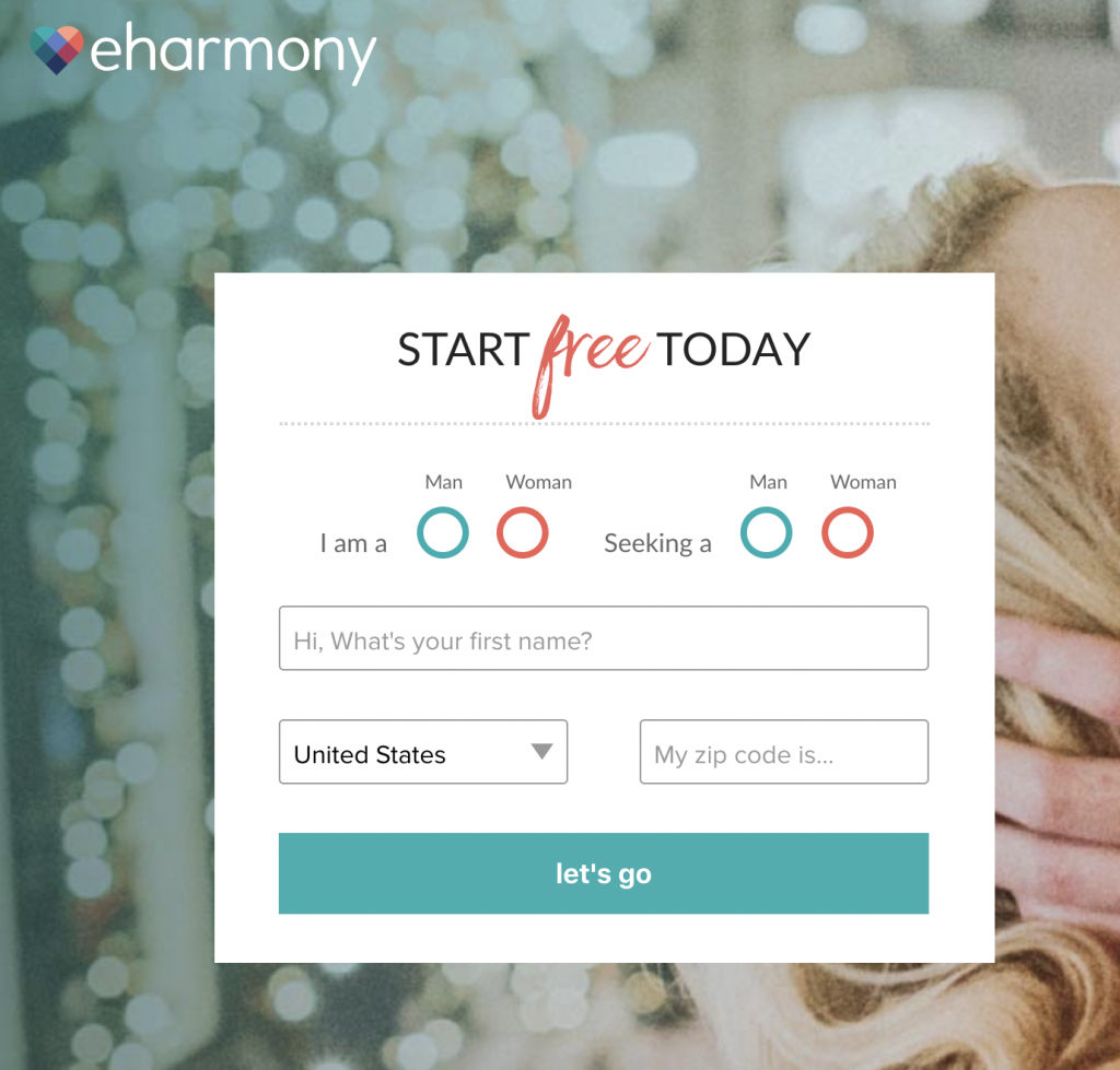
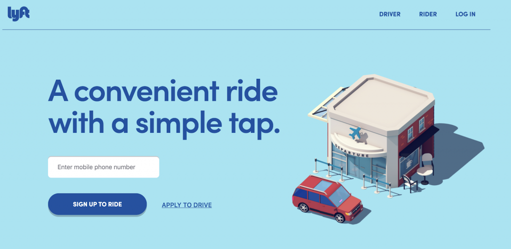
When it comes to form fields, less is more. Users don’t like to spend too long filling out forms – it’s a laborious, boring task. That’s why you should aim to only ask for the bare minimum.
Studies show that reducing the number of form fields from 11 down to 4 drives 120% more conversions, on average. The same study found that asking for a telephone number in your forms reduces conversions by 5%.
I’d recommend sticking to just 2 fields: email and name, if possible.
4. …Or eliminate them entirely
Another top design tip is to eliminate boring form field text boxes entirely and replace them with something else. Forms that don’t look like forms tend to convert the best. After all, when was the last time you enjoyed filling out a form?
One way to do this is to replace empty textboxes with clickable elements, like drop-down lists or toggle sliders.

This reduces the ‘cognitive load’ on the user as they don’t have to think and type, they just have to click. It’s a neat bit of psychological trickery that can increase your conversions.
5. Consider multipage forms
If you can’t reduce the number of your form fields too much as you really need to gather a lot of data from your users, then consider splitting your form up into multiple pages.
One study found that multipage forms have significantly higher average completion rates than single-page forms. This goes back to what we were saying about users being put off by too many form fields. If you have more than three, you can separate them up into different pages, so that your user only sees 3 at a time, making the task of filling them all out feel much easier.
6. Make some fields optional
Another good idea is to make some of your lead gen form fields optional. Allow your user to submit their data after filling out just a few details, then ask them to fill in additional details later. That way, if they give up halfway through, you won’t have lost a lead.
7. Use the right anchor text
Interestingly, anchor text can actually be more effective than buttons when it comes to driving conversions, according to some studies, but it’s important to use the right anchor text.
Strangely, users show a preference for certain CTA words than others. For example, ‘click here’ has been shown to convert better than ‘submit’. This may be because the former feels more non-commital than the latter. Experiment with different anchor text to see what works for you.
‘Click Here’ converts better than ‘Submit’
8. Minimize ‘friction’
One of the most important design principles to stick to when creating your lead generation forms is to minimize ‘friction’. Friction refers to distracting, conflicting elements that draw your viewer’s attention away from the important stuff.

“To minimize friction on your forms, make sure to use white spaces. White spaces make your forms more readable and guide your viewers’ eyes, helping them to better navigate the page, thus boosting conversion rates.”
Michael Jenkins
You should also aim to sync the surrounding images with the form itself to create a page that works together holistically. It’s all about synergy.

Navigation elements like navbars are unnecessary and add friction, so do away with those on your lead gen landing pages.
9. Fully utilize visual elements
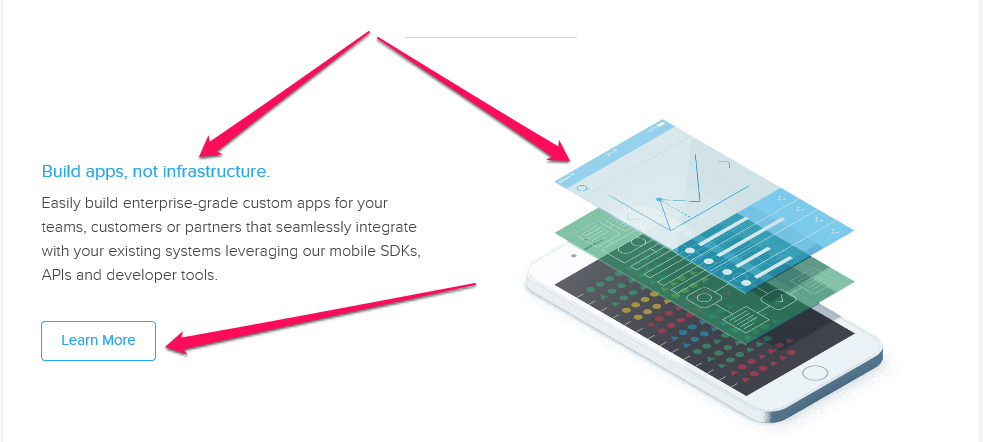
All good landing forms utilize some visual elements. Icons, directional shapes (like arrows), product images, buttons, and videos all help to make your lead generation form more compelling and easier to navigate for your viewers.

10. A/B test different designs
Our final tip is to make sure you’re using A/B testing to inform your lead gen form designs. A/B testing allows you to compare different design elements to see what drives the most conversions, and it’s to getting it right.
Everyone’s customer base is different, so the only way to figure out what works for yours is to test, test, test! If you need more help regarding lead generation contact Shout, we provide digital marketing services in Australia.
Good luck!

