You have a cool website, you put up advertisements, you even managed to create a landing page, but your conversion rates are just not looking up.
Can you relate to this problem? Then this is the best place to get all your answers.
In our Conversion Rate Optimization (CRO) journey, we’ve come across several strategies that can increase your conversion rate fast!
We’ll mainly focus on the latest CRO strategies, ad creation, and e-commerce conversion best practices.
Additionally, we’ll help you find funnel drop-offs so that you can streamline the customer experience and stop losing conversions any further.
Towards the end, we’ll talk about five websites that dramatically improved their conversion rates using these super-effective techniques. Make sure to keep reading!
7 Ways to Improve Conversion Rates
Driving visitors to a website is no easy task. But you handled it with your digital marketing savvy and SEO. It’s time to move on to the next step- turning website visitors into customers.
In this 2022 guide on conversion, we’ve described seven ways to convert fast, drive sales, and grow your business online.
Choose Your Website Platform Wisely
If you want to get your online business off the ground, start with an efficient website. A high-converting website is one with engaging content, easy navigation, and eye-catching visuals.
At the same time, you want to keep your marketing resources, sales channels, shipping, feedback, and payment options in an accessible layout.
You can increase your conversion rate much quicker with WordPress, Drupal, Joomla, Magento and other basic website builders. The majority of website owners use WordPress because it’s more intuitive and easier to use.
Shopify is suitable for all types of e-commerce businesses. You can increase conversion rate Shopify because it allows you to provide smooth engagement, navigation and checkout experiences for your customers.
A Conversion-Friendly Website Design
You don’t have to be an expert website builder to drive sales and build your brand identity. There are many website builders and plugins that will do the job for you. So, what you need to do is ensure that your website has the following elements:
- Catchy and effective headlines
- Engaging photos and video pitches
- A recognizable call to action button
- Clear and intuitive navigation path
- Action-oriented layout and sign ups
- Social proof, live chat, and FAQs
- A clear value proposition
- Web-safe fonts
- Fast and easy transactions
- No unnecessary form fields and pop-ups
- Mobile-friendliness and fast page loading speeds
These are the ten elements of a high-converting website. Designing an e-commerce website with these things is one of our key strategies to increase conversion rate.
Simplify the Conversion Process for Your Visitors
You have to grab the visitors’ attention within a short period of time to increase your conversion rate. Ecommerce conversions include but not limited to the following actions:
- Visitors sign up for a discount
- Users subscribe to your emails
- Potential customers add products to their shopping cart and then leave
- Clicks the live chat icon or fills up a form
- Someone watches a video or interacts with your website
To simplify the last step of the conversion process which, ideally, is a transaction, make sure that the checkout forms are easy to use.
You can put a Check Price option on the landing page and link it to the pricing page for quick conversions.
Consider adding social media icons or a shareable link to your website content, offers, and announcements.
Shopify improve conversion rate: Shopify allows you to sell through your website, social media, and a large number of online marketplaces, effectively market your business and get comprehensive insights- all in one place.
Attract More Traffic with Paid Ads and CRO
Optimizing content with CRO is slightly different from SEO. In Search Engine Optimization, you focus on page visits to earn revenue. Therefore, you use keywords with higher search volume to make your content seen by a large audience. What you get is thousands of visits and low conversion rates.
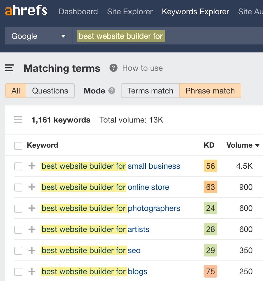
When it comes to CRO, keywords have to bring visitors over to your website and encourage them to take actions. Here you need to target a narrower and more relevant audience. You can achieve it by using long-tail keywords.
Refer to People Also Ask and Related Searches on Google for long-tail keywords. Or, head over to Ahref’s Keyword Explorer to see relevant keywords and FAQs at one place.
Set Up Conversion Goals and E-Commerce Transactions
Any user action, engagement, subscription, or payment can count as conversion. Choose your Google Analytics Conversion Goals so that you can track your performance the best possible way.
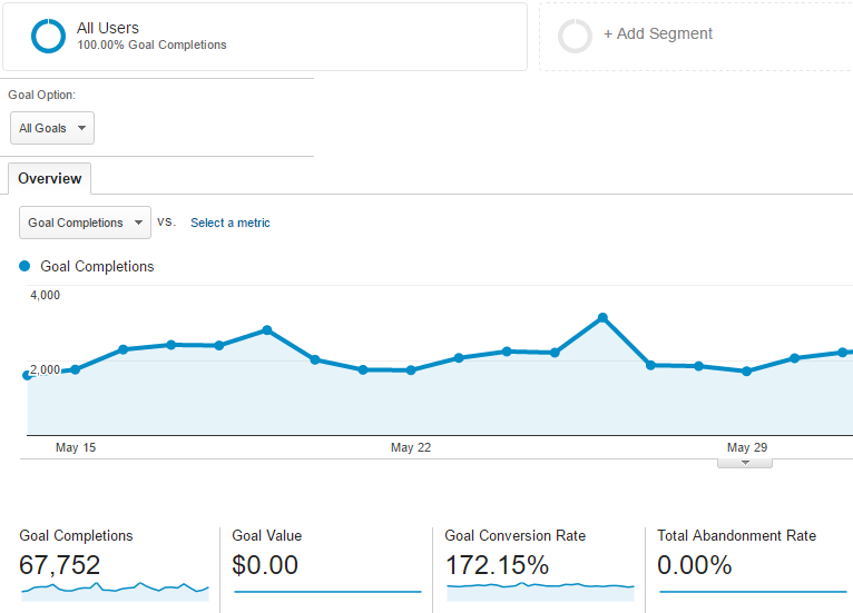
We’ll soon explain how to create, customize, and manage conversion funnels from scratch. For now, make sure that users can easily complete transactions and e-commerce activities on your website.
Go to Profile Settings in Analytics, visit E-Commerce Settings from there, and then follow the on-screen instructions.
Last but not the least, update your Google Analytics with web forms, live chat, and phone call options to determine which marketing resource is generating the most revenue.
A/B Testing to Learn Whether a Marketing Strategy Works
Conducting an A/B testing can reveal important attributes of your digital marketing campaigns and CRO. If a new trick is not latching on, you can identify it early on with a split test and save your time.
There’s a lot of scope to increase ecommerce conversion. A/B testing or split testing, is a simple marketing experiment where you divide the audience to test different variations of a campaign.
It can show you how CRO can impact your conversion rates in the short term. Google Optimize is an efficient platform to do A/B testing and get insights.
To narrow down visitors based on their previous on-site actions, location, number of site visits, and etc, you can use Google Analytics Audience Targeting. Just like Optimize 360, it’s faster, more efficient, and offers multivariate testing up to 36 combinations.
Improve Your Website’s Usability
To truly optimize your conversions, look at every opportunity to drive sales from your target audience. You should make sure that your website is providing an optimal browsing and shopping experience.
First, you need to know about a website’s usability metrics. They are:
- Home Page Usability
- Search Usability
- Page Layouts
- Forms and Data Entry
- Content Quality
- Social Proof
- Task Orientation
- Navigation
- Visual Design
- Help and Feedback
An easy way to improve conversion rate on website is to simplify the navigation. You should use decent colors, typefaces, and imagery that gets your website purpose across.
Moreover, you can use an F-shaped pattern, keeping the important bits and images on the top left sections on the screen.
- Establish a visual hierarchy to guide new visitors through your website
- Use a grid-based layout for a clean, easy-to-follow structure
- Have each page load as fast as possible
- Get UserVoice, or other feedback management tools to improve your B2B website on the go
Boost Your Average Conversion Rate in 2022
If you want to increase your average conversion rate, you have to start from the bottom. There are places in the conversion funnel where you might be losing potential customers. So, we’ll not only help you identify those points but also demonstrate ten CRO strategies for 2022.
What is a Good Conversion Rate?
Conversion rate varies with your goals, traffic, funnel, audience demographics, and CRO strategies. For example, the average conversion rate of global e-commerce sites was around 2% in the third quarter of 2020.
Interestingly, the average conversion rate of the online food and beverage business was a staggering 5.5%. To understand what rate you should be aiming for, look at the competition in your own industry.
Paid Ads vs CRO: Which Can Convert Better?
The problem with paid ads is that cost per acquisition (CPA) increases with conversion rate. So, after a certain time, if you don’t spruce up your CRO, you’ll start losing money because of a high CPA.
We’re saying that more traffic doesn’t always equal more sales. You need to optimize your website so that you can achieve a lower cost per customer.
This way you’ll sell more without spending more money on PPC ads. Conversely, if your CRO isn’t yielding good results on its own, you can improve your conversion rate with ads.
To improve conversions in the long term, you should divide your marketing budget on PPC and CRO- not one without the other.
Where to Implement Conversion Rate Optimization Strategies
Before you try new techniques, find areas in your website that can improve largely from conversion rate optimization. Here are five pages that have the most potential:
- Homepage
- Landing Page
- Product Page
- Blog
- Sales Page
For example, if you display a valuable add-on item on your sales page, you can increase the average order value by 10 percent or more. It can be an accessory, care product, group buy, refill to repair, protection and servicing coverage.
Best Conversion Rate Optimization Strategies
There’s a bunch of do’s and don’ts in CRO. You want to make sure that a good number of visitors convert to customers. So today we’ll share the secrets to a high-converting website, starting with the latest CRO techniques!
Publish Engaging and Shareable Content
Coming up with engaging, SEO-optimized content can jump-start your conversions. Research keywords in advance and try to include them naturally in your blog post. It helps you bring organic traffic to your website so you may enjoy a higher conversion rate.
Make data-driven decisions based on your Facebook Insights and the Audience on your Google Analytics Dashboard. Find out what questions they’re asking with Google AutoComplete, and then develop a relevant content.
It’s vital that you provide a clear value proposition in your marketing content. Use photos to help readers visualize important details and include social media handles to build trust.
Use Text-Based CTAs on Your Blog Posts
When it comes to increasing conversion rates, there are many ways to nudge more visitors to take action. For example, you can use text-based call to action lines.
There’s a phenomenon called banner blindness- the tendency to ignore banner-like info on websites.
Customers will often scan your content for the data they are looking for. Most of the time they leave before reading till the end.
So, you can use a standalone text as H3 or H4 and link it to a well-optimized landing page. Allow visitors to jump straight to the pricing page and check out, requiring as few steps as possible.
Add Social Proof to Build Trust
Sometimes the only thing standing between visitors and paying customers is a simple review. People should be able to rely on your business. In order to build trust and get more conversions, you need to display social proof.
If you’ve gathered some good reviews recently, flaunt them on your website, preferably on the homepage in a slider element. And if you can’t add testimonials, introduce money back guarantees.
This way, you can show enough credibility to your visitors and stand out from competition.
Our SEO experts reported an increase in conversion after highlighting reviews with relevant keywords. They help your business rank higher in searches and also build the visitors’ trust at the same time.
Make Custom Forms for Your Website to Increase Conversion Rates
Custom pop-up form is one of our favorite conversion optimization elements. It can enrich your CRM with leads, and eventually pull up your website’s conversion rate.
Heat maps play a critical role in driving conversions. They show you the places where the majority of visitors interact with your website through clicks.
Scroll maps are just as valuable. For example, they tell you when and where most people stopped scrolling. It enables you to overhaul your website design and make necessary changes.
Optimize Your Landing Pages
Also known as lead capture pages, these are standalone web pages created specially for a marketing campaign. A landing page is among the most critical pages for conversion.
It’s where a person lands after they tap on a link in a social media content, email, guest post, or advertisements from Facebook, Google, Instagram, Twitter, YouTube and similar platforms on the Internet.
You can use popular landing page builders such as LeadPage and Unbounce to get started. As for landing page optimization, start with a compelling copy, a well-defined offer, and CTA.
Enable tracking from Google Analytics Campaigns and find the landing page report from your Dashboard, under Search Console> Behavior> Landing Page.
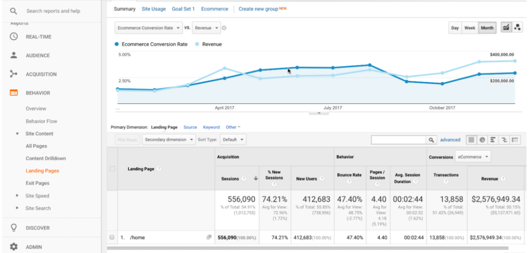
With the help of custom metrics and filters, you can compare different pages, or the same one against different timelines. Set up ecommerce tracking to analyze conversion rates and revenues.
Help Visitors Become Marketing Qualified Leads (MQLs)
You shouldn’t go overboard and blast your incoming traffic with colorful pop-ups and auto-play videos. More often than not, it confuses the visitors, decreases your page loading speed and ultimately drives up your lost sale numbers.
If you already did that, you still have a good chance at recovering lost sales. For starters, you can create effective abandoned cart emails.
According to a Zembula blog, you can win back more than 10% of those potential customers with an abandoned cart email.
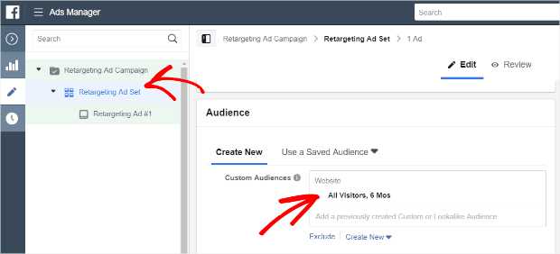
Similarly, you can use Facebook retargeting ads for people who already interacted with your e-commerce site. It’s a smart way to encourage visitors to complete a conversion. For this, you have to install the Facebook Pixel code, select your custom audience and choose a frequency cap from Facebook Ads Manager.
Use Sticky Elements and Videos
Videos have the power to influence your target audience and keep them engaged till the end. They are valuable tools to increase your conversion rate in ways that other media files can’t do. You can create an explainer video, product demo, or a sales pitch video.
Ideally, a video sales pitch shouldn’t be longer than two minutes. Sticky elements help you communicate directly with the visitor.
Like a live chat feature, sticky elements create a personalized experience for visitors, collect information, send instant price quotes and answer queries.
Increase Your Website’s Mobile-friendliness
To enjoy better conversion rates, make sure that your website is responsive on a smartphone. You must improve the website’s crawlability so that visitors don’t stumble across broken links or an error. Bad crawlability hurts your ecommerce conversion rate and ranking as a whole.
Did you know that 77% of mobile searches are made from home or an office- places where a laptop or desktop computer is likely to exist?
So, creating a mobile version of your website can help in increasing conversion rates.
If you used WordPress, Drupal, Tumblr, or similar content management softwares (CMS) to build your site, check out this guide to creating a mobile-friendly website. Take the Mobile-Friendly Test from Google Search Console to check whether your website is fully operational on a smartphone.
Accelerate Page Loading Speed
A study by AdExchange and Google disclosed that 53% of mobile users bounce from a website after incurring more than a three-second delay.
In the same study, faster websites reported a 70% longer session length when compared to slower websites and generated twice the revenue.
Having a speedy website also cut down the bounce rate by 35%.
Page loading speed has been a consistent Google rank factor. So, you should focus on making a faster-loading site if you want to improve website conversion. First, get your score from Google PageSpeed Insights and then do the following:
- Use a Content Delivery Network (CDM) for websites that use HTML, JavaScript, images, videos, or stylesheets
- Turn on GZip compression to reduce the size of JavaScript and HTML files
- Remove unnecessary characters and spaces from your CSS files through minification
- Efficiently trim the HTML code to load a website faster on phones
- Avoid URL redirects
- Clear render-blocking JavaScript
- Decrease the number of HTTP requests
- Use WordPress image optimization plugins to compress and resize images on a landing page
- Remove unnecessary images and unused files from your media library
- Get Expires Headers to decrease the page loading time for returning visitors to a website
Give Personalized Offers
There’s a huge possibility that your website consists of multiple products and services. When you highlight a single set of products on your landing lage, you potentially lose customers who were interested in another product.
An easy way to improve ecommerce conversion is using multiple event pages. First of all, you can introduce different offers to your visitors based on their search intent and demographic.
Research shows that websites with 40 lead capture pages can get up to 12 times more leads than websites with 5 or fewer pages.
The more personalization you provide, the more likely you are to convert a bigger number of clients. Make sure to add a compelling CTA on your landing page along with user feedback if possible.
Ecommerce Conversion Optimization: 5 Case Studies for Success
Let’s face it, getting conversions is one of the most challenging jobs for an e-commerce web developer.
That’s why people continuously test different CRO methods to figure out what works best for their websites.
Read about five websites that dramatically increased conversion after implementing these effective CRO techniques.
A Well-Defined Call to Action
Stanley Black & Decker, one of the largest manufacturers of power tools, was able to increase their click-through rate by 17% by changing their CTA button on a product page from “Shop Now” to “Buy Now.”
One simple change resulted in a six-figure projected revenue increase. They used multiple A/B/N tests to drive sales, and eventually switching up the CTA text made all the difference.
The Power of A/B Testing
GoCardless wanted to see what their customers responded to the most- a call from their sales rep or a demo of their services.
The team wanted to determine whether visitors would sign up for a demo or wait for a call. So, they changed the CTA to Request a Demo through A/B testing.
Fast forward a few days, GoCardless increased their website conversion rate by 139%.
- Remove Unnecessary Choices and Distractions
Websites that feature a lot of products like UK Tool Centre, often make the mistake of showing too many page elements on a single screen. It can dampen your conversion rates.
So, when UK Tool Centre finally removed some filters from their product page, page engagement rose by 27%.
- Make Your Product Pages Scannable
SmartWool.Com sells socks for men and women in multiple colors and variations. To increase ecommerce conversion, they ran an A/B test of two website layouts.
Page B generated 17% more revenue per client than page A. Evidently, visitors liked that they were able to scan the product page easily and moved to check out.
- Ensure Mobile-Responsiveness to Engage Visitors
If you want to keep your bounce rates in check, follow the example of Skinny Ties.
The company completely redesigned their website for mobile users. Plus, they used catchy lines and aesthetic visual elements.
This led to a 44.6% increase in the time per visits, a 42.4% increase in revenue, and a 13.6% rise in conversion rate.
How to Create Ads that Have a High Conversion Rate: 7 Ways to Get Started
For beginners, it’s difficult to write a conversion-driven ad and then incorporate the right visuals.
The characteristics of a good advertising copy are the ability to address user benefits, an efficient ad format, and a well-defined value proposition.
Now that you know what they are, you’re one step closer to creating ads that increase conversion rate ecommerce.
Use a Short Actionable Copy
Keep your sales copy effective and short to improve conversion rate on website. Especially at a time when e-commerce conversion rate is low, you should go all out on your copy.
Start with a believable headline, avoid technical vernacular and try to write the content in a friendly, informative tone. Highlight your value proposition so that it stands out from the body copy.
Integrate Facebook SDK for Apps
According to Google Search Central, the majority of visitors coming to your website use a smartphone. So, make sure to track conversions from a mobile device to draw accurate conclusions about your campaign.
To further optimize your mobile app advertisements, get started with Facebook SDK for iOS and Android. Basic conversions supported by Facebook Ads are- Add to Wishlist, View Content, Check out and Purchase.
If you have an ecommerce mobile app, download the Facebook Software Development Kit.
Optimize Link Clicks When Conversion is Poor
When your ad doesn’t generate enough conversions in the first seven days, it becomes difficult for Facebook to deliver the ad to relevant audiences. The same goes for the top paid advertising platforms.
To elaborate, Facebook needs about fifty conversions per ad during the first week of the campaign to deliver an ad effectively. Check with Ads Manager to see the number of conversions you’ve made.
Apart from optimizing for link clicks, you can add URL parameters to an advertisement. This way you can identify where the ad traffic is coming from and Facebook can project the ad to similar users.
Insert Eye-Catching Visuals
Exciting visuals can instantly hook your incoming traffic to not only pay attention to the ad but also respond to the CTA.
It’s recommended that you don’t use a huge load of text elements in the imagery. But if you must, have the visuals rated by Facebook’s Image Text Check tool to determine their performance.
Make sure that the images fit to the designated size specifications. Replace static images with GIfs or videos to drive conversions. It’s a good practice to optimize video ads for different social media channels before publishing.
Optimize for Conversions
If you test for traffic-optimized ads and conversion-optimized ads, you’ll see that the latter drives more conversations.
You can enable this feature from the Optimization for Delivery option in Facebook Ads Budget and Schedule. From there, select the “Conversions” box and start converting!
Select the Right Ad Format
By choosing a suitable layout, you can decrease your cost per conversation and increase revenue.
For example, Adidas decided to drive sales for their Z.N.E Road Trip hoodies using the Facebook collection ad format. They were able to cut CPC by 43% and receive a 5.3x return on their ad spend.
Therefore, when you have various products to advertise, carousel ads are the right way to go.
Canvas ads are suitable for impactful full-screen visuals. You can opt for Facebook Offer ads for showcasing limited time deals and discounts.
They work as purchase incentives and whenever someone interacts with the ad, Facebook sends reminders to redeem the offer.
Retargeting Ads to Complete Conversion
At the end of the day, most people who have visited your website won’t take your desired action. Don’t worry. It’s easy to re-target them on Facebook, Youtube, Twitter, and other platforms.
For example, you can set up Facebook Pixel for your pop-up campaigns and website. It will give you an overview of the type of visitors that interact with your ads.
Alternatively, you can use popular lead generation and conversion tracking tools such as Google Ads, Unbounce, OptinMonster, Leadformly, Mailchimp, and more.
Mapping Conversation Funnel Drop-Offs
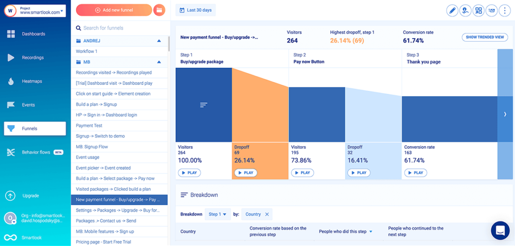
A conversion funnel or a sales funnel is a flowchart that helps one visualize the process from when a visitor lands on a website to the point where he takes an action e.g. make a purchase.
You have to streamline that experience for visitors and take them to the bottom of the conversion funnel. It’s where the leads make the decision to purchase a product or service from you.
To fast-track your conversion rate, you need to start reducing friction in your sales funnel. Gather around your sales team and conduct a thorough funnel analysis. Use tools such as Amplitude’s Pathfinder to visualize the sales funnel and optimize it from there.
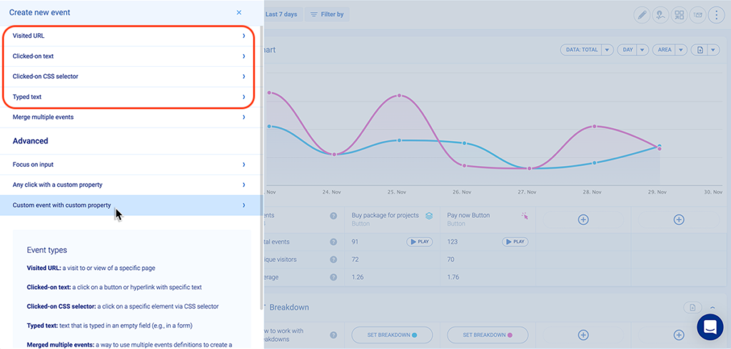
As you can see from this SmartLook funnel analysis page, customers can drop off at any point of the funnel. So, it pays off to add events such as Visited URL, Typed Text, Clicked on CSS Selector, Typed Text etc. for tracking navigation. You can view screen recordings of visitors who dropped off at any stage, improve the funnel and then compare your results.
How to Set Up Goal Funnels of Google Analytics Step by Step
We’re already using Analytics to check campaign stats, optimize landing pages, and monitor conversion rates. So, setting up goal funnels in Analytics was a matter of time. The first thing you need to do is embed the Google Analytics Tag on your website.
Step 1: Go to the Admin Panel
Find the Admin section at the bottom-left corner of your Google Analytics Home.
Step 2: Select “Goals” from the relevant View
If you created multiple Views for your campaign, click on the right view, and then choose Goals. It’s between View Settings and Filters.
Step 3: Add a New Goal
On the Goals screen, click on the red icon that says New Goal. You can add and manage 20 goals at a time.
Step 4: Pick a Goal Type
Under Goal Setup, you’ll see templates that read Revenue, Acquisition, Inquiry, and Engagement. There are multiple sub-sections under each category that you can check off.
Select Custom to personalize your sales funnel and click Continue.
Step 5: Fill out your Goal Description
Give a Goal Name clear enough that you can identify it later on at a glance. If you plan to set up multiple goals, choose 1 from the Goal Slot ID.
You can’t customize the Goal Type just yet, so choose any from Destination, Duration, Screens per sessions, and Event.
Step 6: Specify your Goal Details
As for the most important step, you need to complete the Goal Details section. Your campaign goal can be related to users visiting an URL. If you have a page for this particular action, paste its URL in the Equals to box under Destination. For example, it can be a thank you page after visitors signed up on your website.
To make sure that your set-up is complete, click Verify this Goal. At this point, Google will show how many visitors have taken actions that now qualify as a conversion from the last seven days.
Click Save to create your very first goals funnel. You should be able to see an overview of your goals like this:
Step 7: Identify the Drop Off Points
After a few days when Analytics have gathered sufficient data, you can check your funnel visualization to recognize the drop off points. Go to Reporting> Conversions> Funnel Visualization.
The red bar helps you visualize how many users exit on each page. As you can see, 42.87% visitors who added things to their carts proceeded to the billing and shipping page. And 78.65% of those users followed through with payment.
On the right side of your screen, you’ll see a box that tells you when and where those visitors dropped off. That’s pretty much all the information you need to track user behavior and identify the drop-off points in your conversion funnel.
Rounding Up
There’s no alternative to conducting A/B split tests to increase the conversion rate in the long term.
Congratulations! Now you know how to level up your conversion rate optimization skills in 2022.
The examples, case studies, strategies, and how-tos should be enough to jack up your conversions. At the same time, you should aim for more traffic.
Using our techniques, eliminate the lead drop-off issue from the sales funnel to grow your revenue. Feel free to contact our SEO agency in Sydney to increase your conversion rate. Thanks for reading!
